
The Context
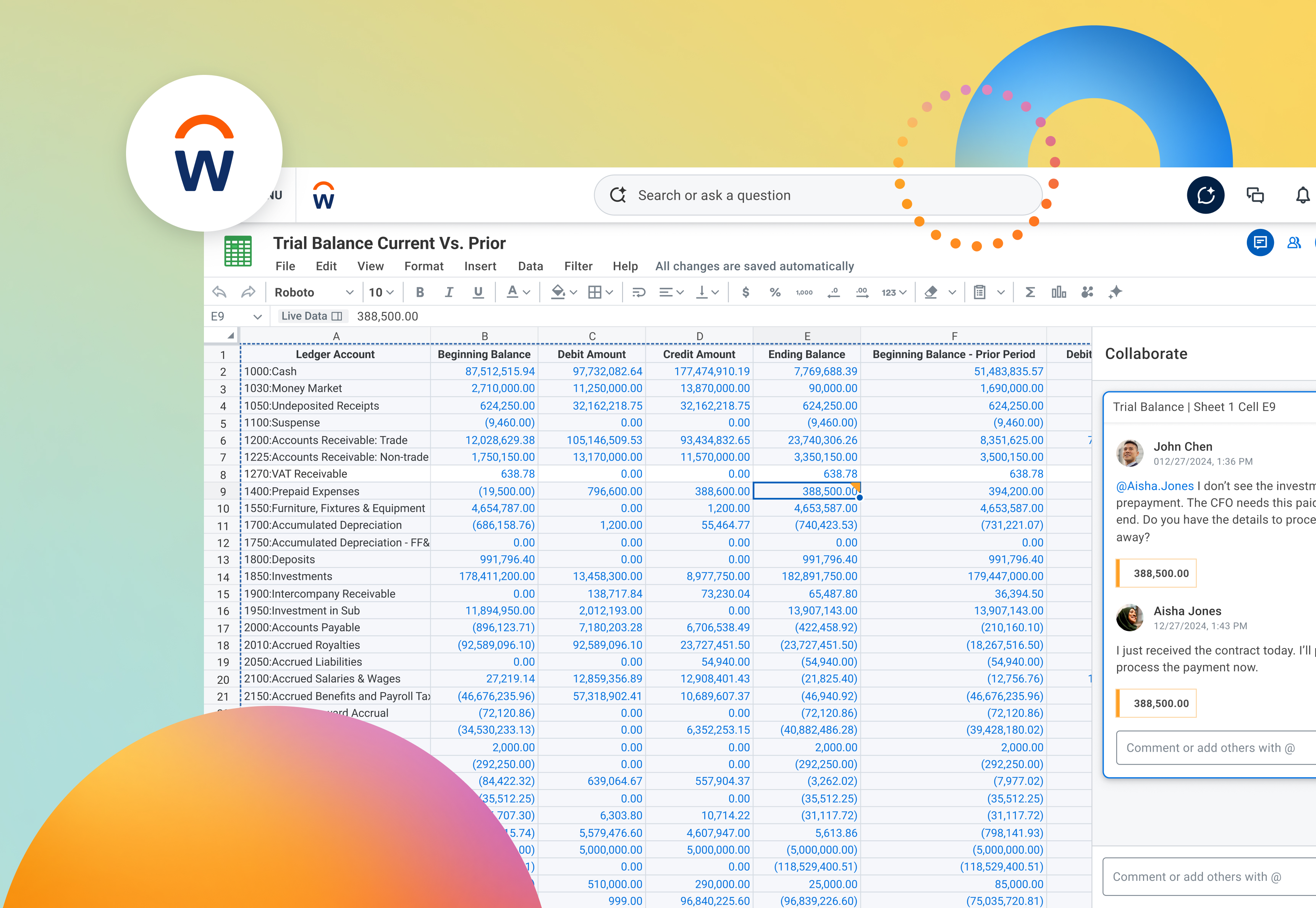
At the end of the Workday + Sana project, I wrote that the deeper question I was moving toward was what an agentic-first Workday actually looks like. Not AI bolted onto existing surfaces, but capabilities surfacing as contextual widgets inside a single intelligent interface.
This is that work.
The premise sounds simple: let an agent assemble the interface from components we've already designed and approved. The problem is that our design system, like every design system, was built on an assumption nobody had ever needed to question. It assumed a person was doing the choosing.
A designer opens Figma, reads a usage guideline, considers the context, and picks a card. Every part of that sentence is doing work that a design system never had to make explicit, because a human was always there to supply it.
Take the human out and the whole thing quietly stops functioning.
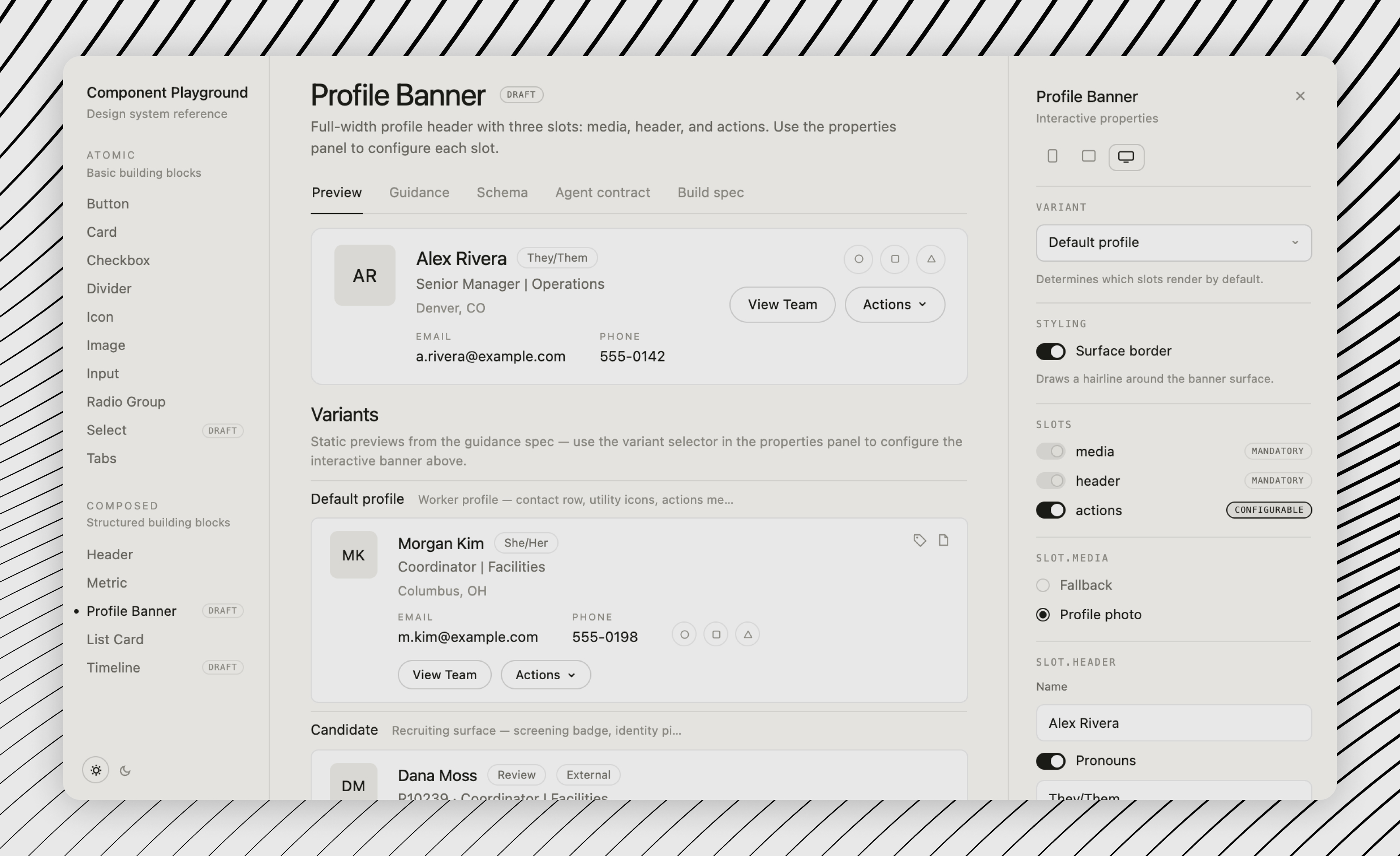
My specific ownership: the guidance and metadata layer that makes components selectable by an agent, the redesign of the component set they compose from, and the working environment where design, engineering, and agent contracts stay in sync.
That first part, encoding judgment as data, is where it got interesting.
Two Readers, One System
Our documentation was good. It was also written entirely for one audience.
Here is a real usage guideline, lightly paraphrased:
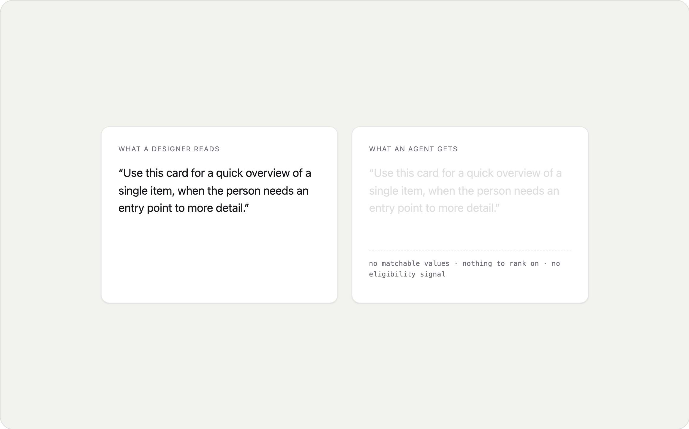
"Use this card for a quick overview of a single item, when the person needs an entry point to more detail."
To a designer, that's clear. You know what "quick overview" means. You know what makes something an entry point. You've absorbed a hundred unstated rules about density, hierarchy, and when a thing deserves its own page.
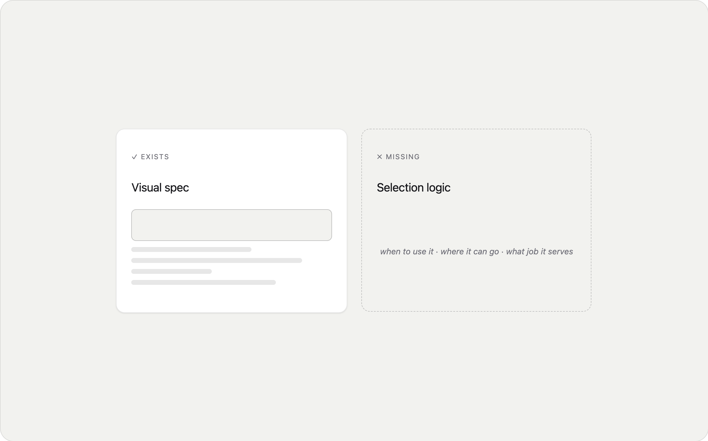
To an agent choosing between forty components at runtime, that sentence contains nothing it can act on. No values to match. Nothing to rank by. No way to determine eligibility. It isn't overwhelmed by the guidance, it has none.
That reframed the work. I wasn't there to write better guidelines. I was there to encode the judgment that guidelines only gesture at.
What the Catalog Actually Contained
There was a second problem sitting underneath the first.
The components being served to agents came from a borrowed reference catalog, a generic set built to demonstrate what agent-rendered UI could look like. It contained a coffee order card. A flight status card. A calendar day with an "add to calendar" button.
Useful as a proof of concept. But we don't sell coffee, and a demo catalog knows nothing about how enterprise work actually happens.
So the two gaps compounded. Our real components carried no machine-readable meaning, and the components agents could actually reach for were placeholders. An agent composing an interface was choosing from the wrong set, with no basis for choosing well.
Our Approach - Encode the Judgment, Not Just the Rules
Separate what's always true from what depends
The first useful distinction: not all metadata behaves the same way.
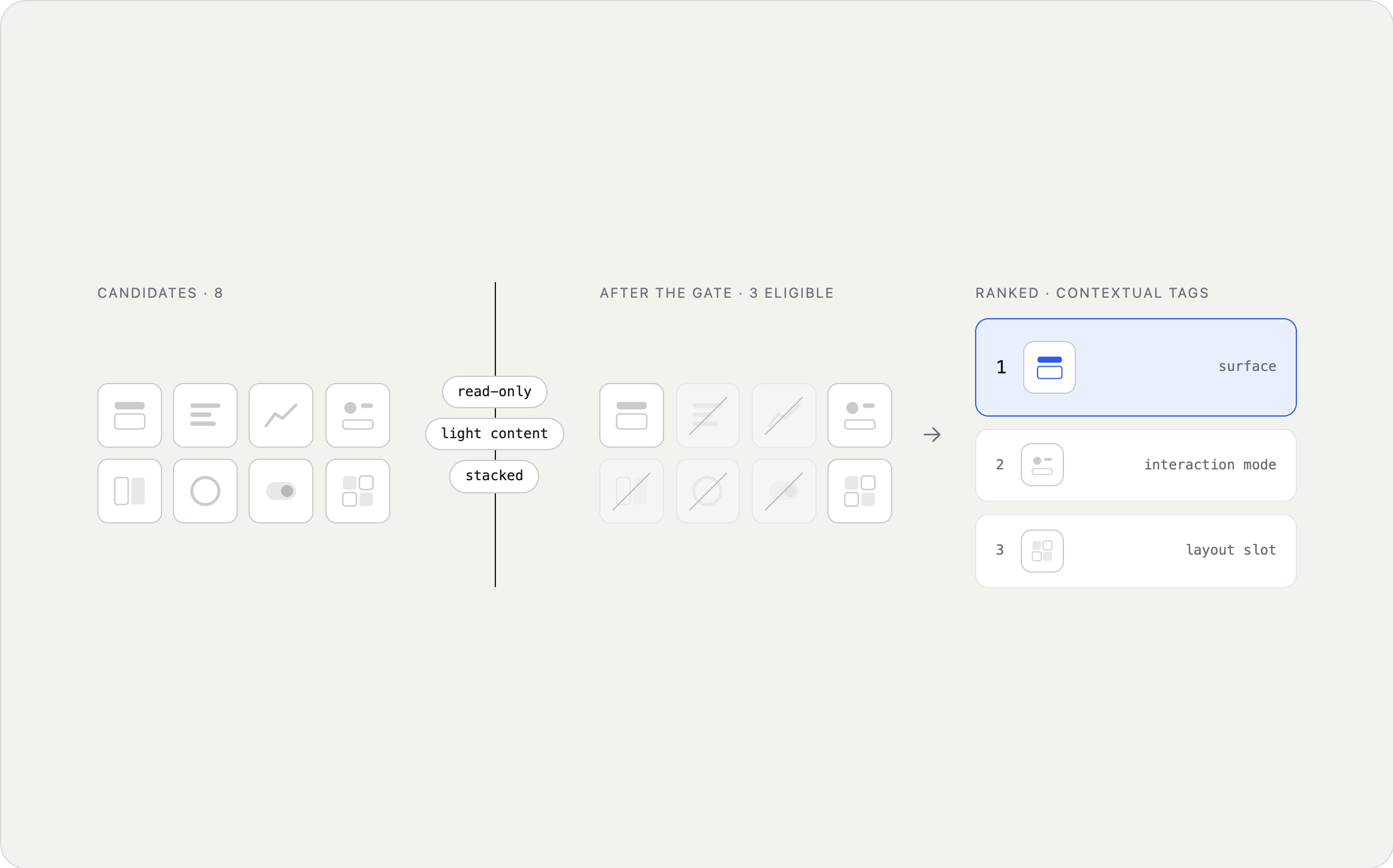
Hard tags are always true. A card is read-only, light-content, and stacked, wherever it appears. These gate: if a hard tag doesn't match the situation, the component is ineligible. Full stop.
Contextual tags vary by use. Which surface, which interaction mode, which layout slot. These rank whatever survived the gate.
Gate, then rank. Two steps, in that order, and the order is the whole point. It makes runtime behaviour predictable, and it tells you where each piece of metadata belongs: base components carry constraints, the purpose-built components composed from them carry context.
Encode what the person is doing, not what the component is
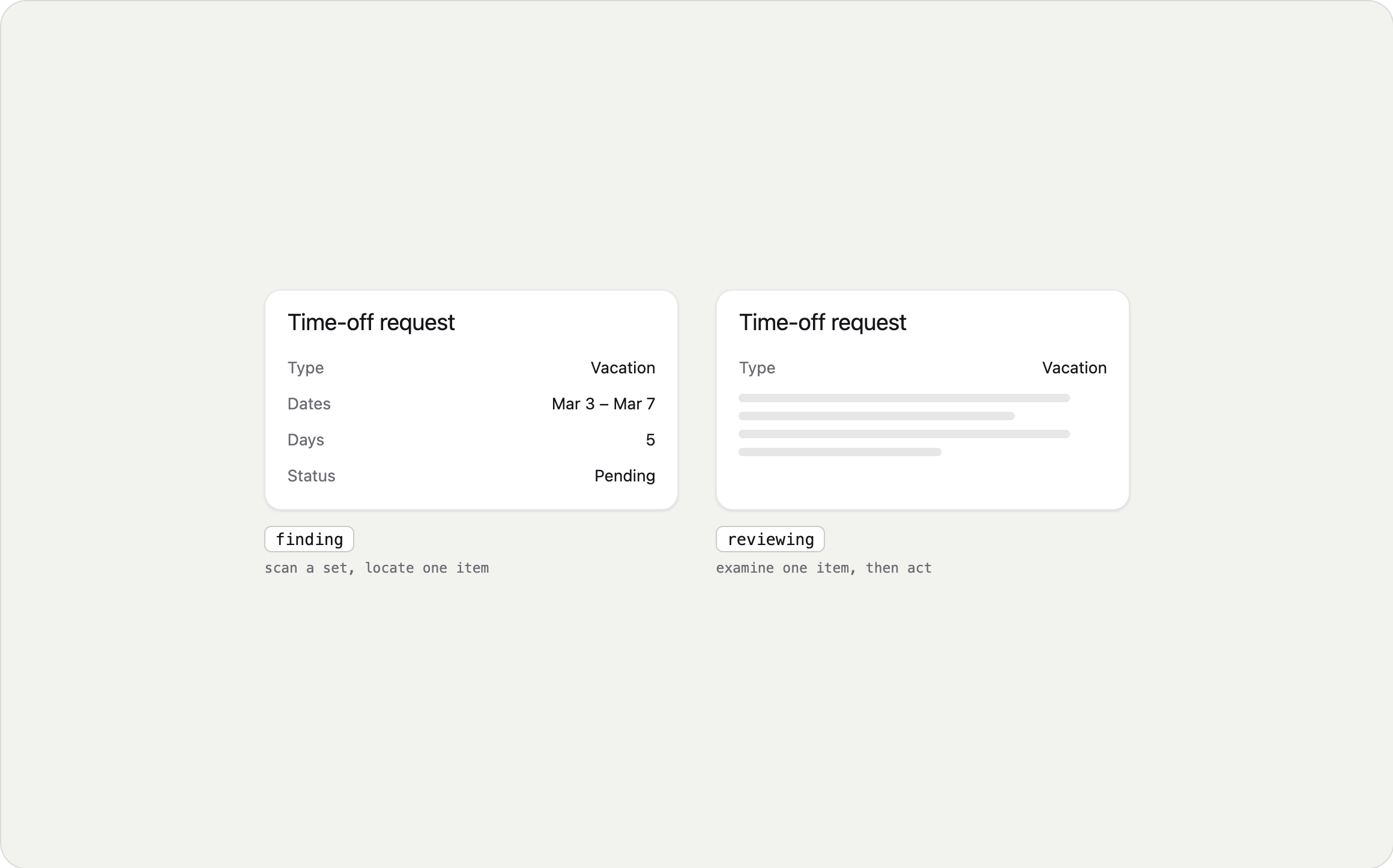
The single most useful field turned out not to describe the component at all. It describes the job the person is doing.
Two cards can look nearly identical and serve completely different purposes. One exists so you can scan a set and locate one item. The other exists so you can examine a single item and decide something. Same shape, same footprint, entirely different jobs. And the job is what determines which one an agent should reach for.
Getting this right meant being disciplined about not over-claiming. Early on I tagged a component with a mode meaning "finalise or close out an activity." When I checked that definition against how the component actually worked, it didn't hold. The thing was an entry point. It leads you somewhere else. It never finalises anything.
Removing that tag mattered more than adding it would have. A padded list of modes means an agent confidently offers a component for work it can't do.
Build something you can click
Documentation that only exists as documentation goes stale, and nobody notices until it's wrong.
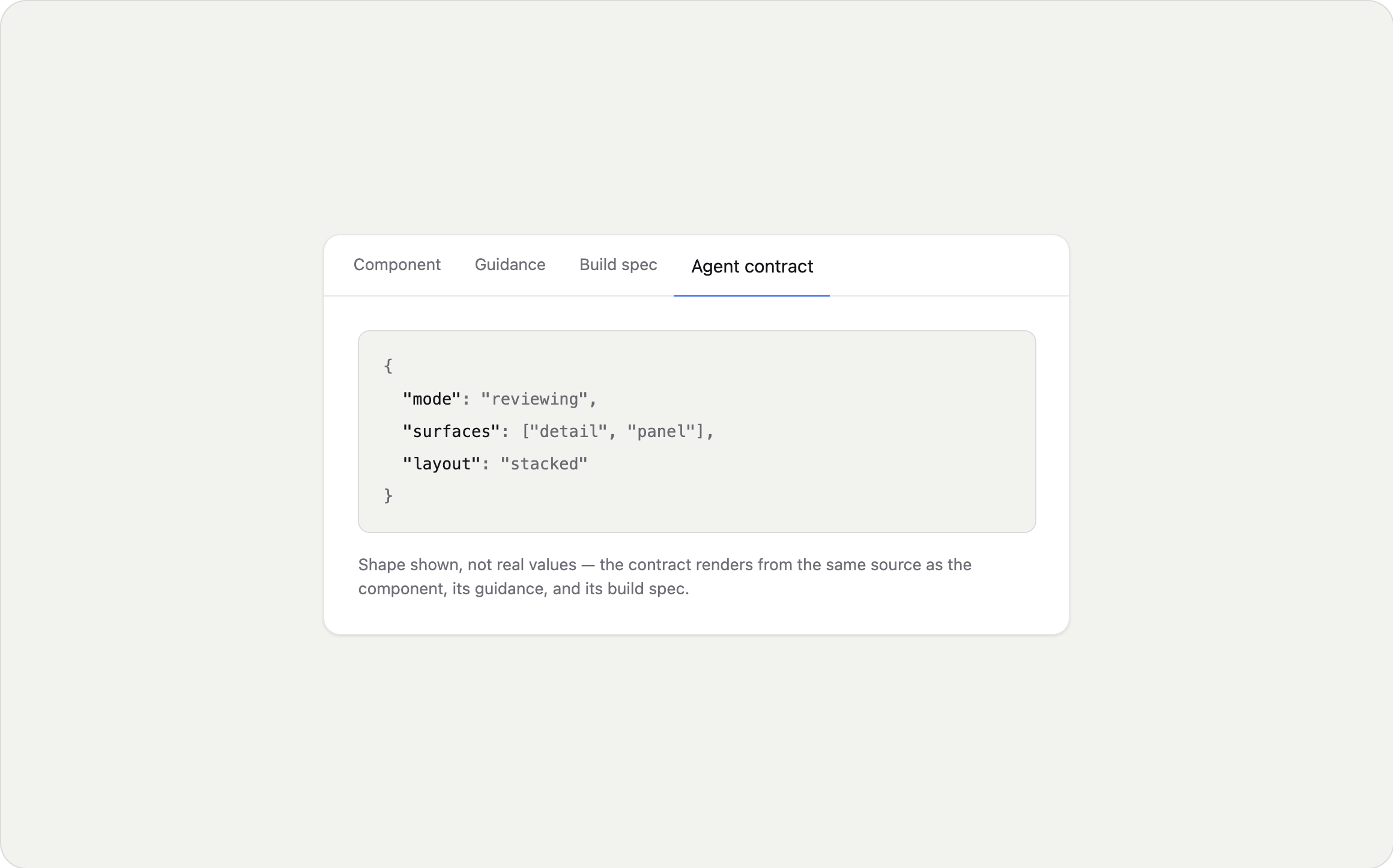
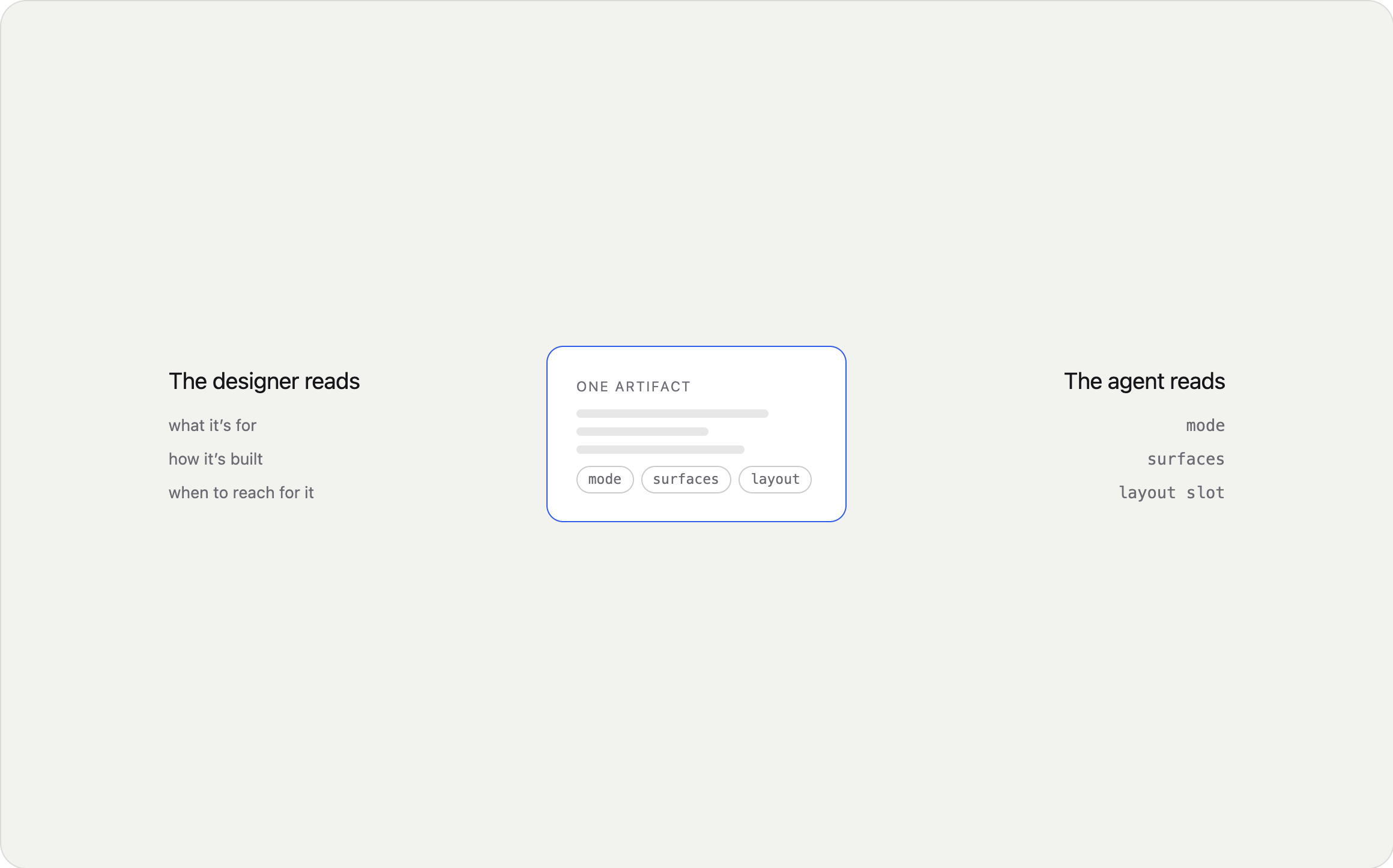
I ran a live environment where each component sits next to its guidance, its build specification, and its machine-readable contract, all rendering from one source. Designers, engineers, and agents inspecting the same artifact instead of reconciling three versions of it.
It also forced honesty. If the guidance claimed a component behaved a certain way, you could click it and find out.
From Coffee Order to Calculation
The clearest way to show the method is one component, start to finish.
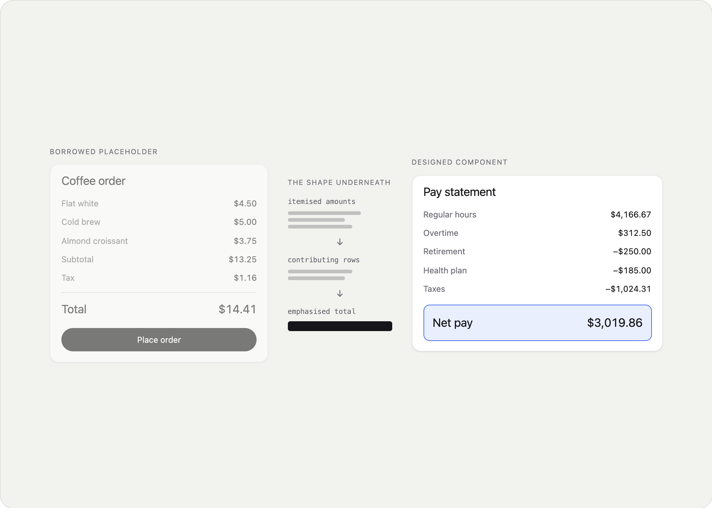
The placeholder was a coffee order card. Line items, subtotal, tax, total, one primary button.
Stripping the fiction, the shape underneath isn't commerce at all. It's a calculation: itemised amounts that resolve to a total, which a person verifies before deciding something. That archetype is everywhere in enterprise software.
Research grounded it. I looked into how the pattern actually appears in real flows and found three instances that had nothing to do with each other: benefits enrollment, where you review your elections and their total cost before signing. Expense approval, where you review someone else's itemised claim before approving or sending it back. And a payslip, where earnings, deductions, and taxes resolve to net pay.
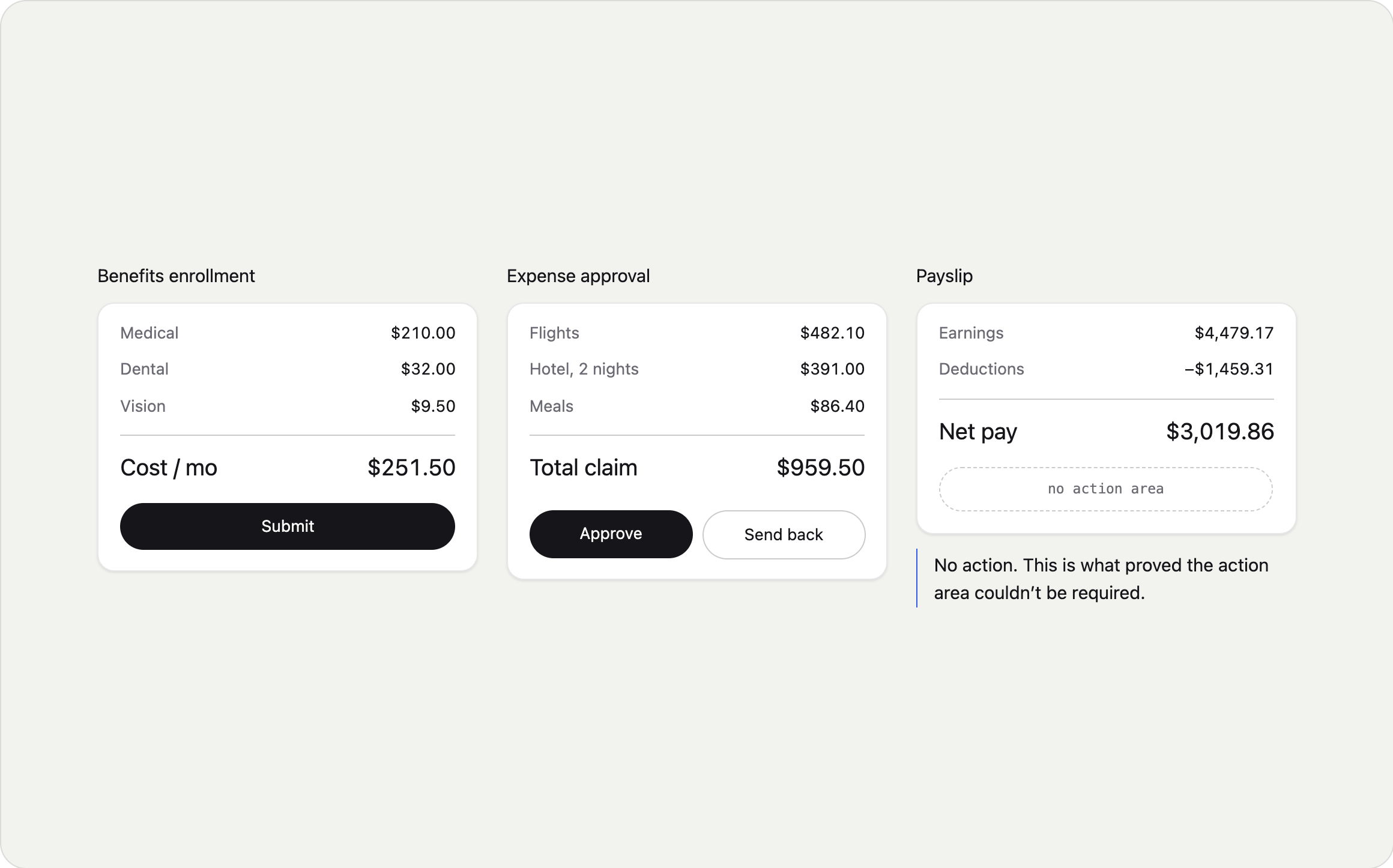
Two findings came out of that research, and both changed what I built.
The payslip has no action. It's a record. Nothing to approve, nothing to submit. That meant the action area couldn't be a required part of the component. The base had to be the calculation itself, with decision affordances added on top. Without that one flow, I'd have built actions in as mandatory and been wrong about a third of the real cases.
The itemised list is the safety mechanism, not decoration. A generic "Are you sure?" gives a person nothing to check. The line items are what let someone catch a mistake before committing. That reframed the whole component: the calculation is the thing, not a supporting detail underneath a total.
Not Every Variation Is a Variant
The same structure kept showing up in different jobs.
A calculation reviewed by a worker before they commit to it. The same calculation reviewed by a manager deciding on someone else's submission. And the same calculation as a plain record with nothing to decide at all. Same anatomy every time. Three different people, three different moments, three different jobs.
You have three options at that point, and two of them are bad.
You can build one flexible component with a dozen optional properties and let each team assemble it however they need. It stays consistent on paper and drifts immediately in practice, because every team makes slightly different choices and nobody's wrong.
You can build three separate components. They start aligned and diverge the moment one of them gets a fix the others don't.
Or you can build one base with named variants, where the shared structure is enforced and the differences are deliberate.
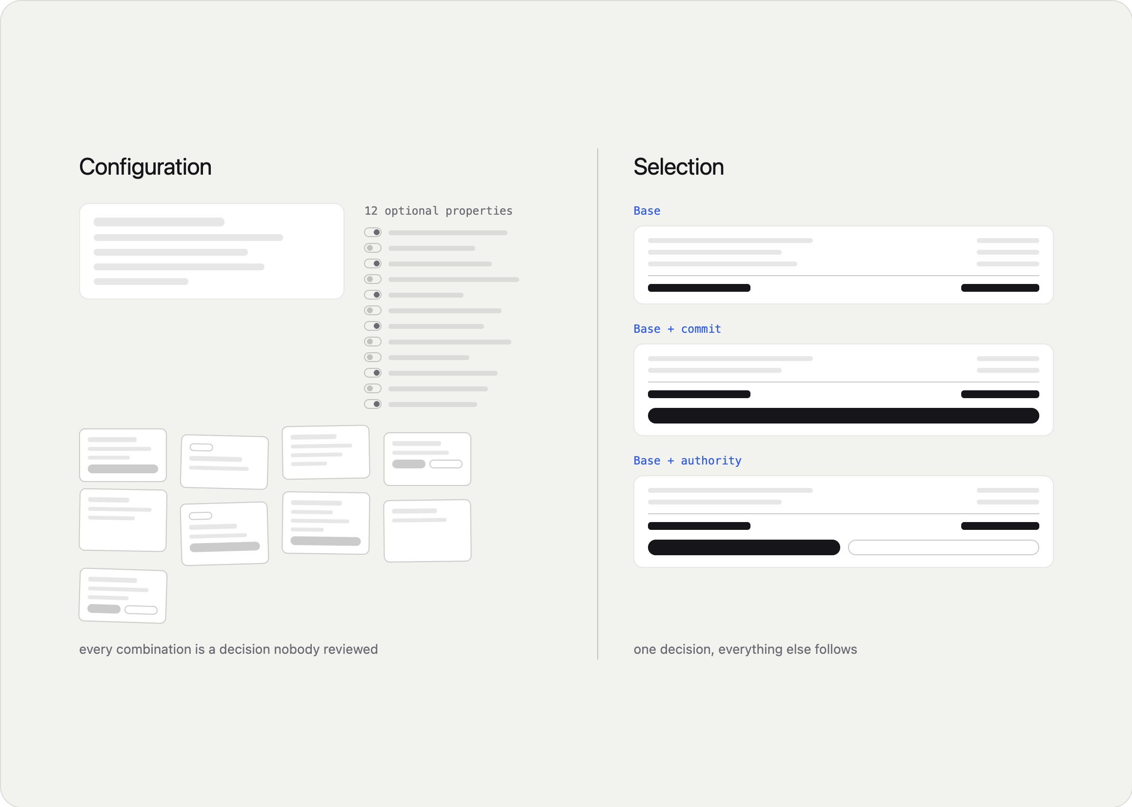
For a human designer, that third option is mostly a convenience. For an agent, it's the difference between working and not.
A single component with fifteen optional properties asks an agent to make fifteen independent decisions, any of which it can get wrong, in combinations nobody has ever reviewed. Three named variants ask it to make one decision, and everything downstream follows from that choice. Variants collapse a configuration problem into a selection problem, and selection is the thing an agent can actually be good at.
That's the argument for variants. The harder question is what counts as one.
The payslip finding had already forced a structural decision: if a real case has no action, actions can't be part of the base. So the base became the calculation alone, and everything else layers on top.
But the component also had a long list of smaller differences: with a status indicator or without, with a footer or without, with an overflow menu or without. A partner asked how those should affect the documentation, and the answer that resolved it was that most variations are subtractive. Removing the status indicator changes what renders. It doesn't change what the component is for, who uses it, or when to reach for it. One set of guidance covers all of them, and writing separate documentation for each would be noise pretending to be thoroughness.
A small number are different in kind. They change the content model or where the thing is allowed to live. One variant swapped its description for a single prominent value, tightened its line clamp, and was restricted to a carousel. That isn't a smaller version of the component. It's a different component wearing the same chrome, and it needs its own rules.
Working With Machines That Write Code
I built most of this using AI coding tools, which changed the shape of the work. I could go from a written design decision to a working component in the same sitting, and pressure-test ideas by building them instead of describing them.
What I learned is that the leverage isn't in generation. It's in specification and verification.
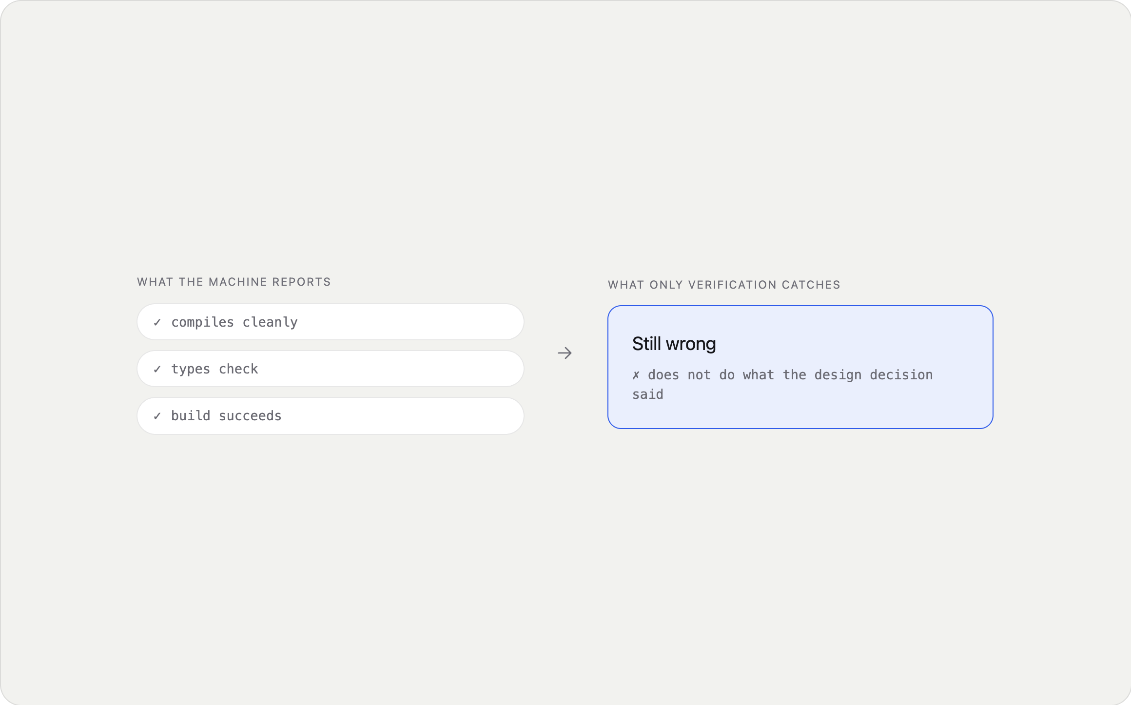
The quality of what came out depended entirely on how precisely I'd defined the decision going in. And more than once, the output compiled cleanly, passed every check, and was still wrong. A successful build is not the same as correct behaviour, and treating them as equivalent is exactly how errors ship.
The design judgment stayed where it belonged. The Summary Card story is the clearest example: the machine proposed a plausible name, and rejecting it was the thing that improved the design.
What I'd Do Differently
Confirm the criteria earlier. In several places the source specs didn't state usage rules, so I drafted them from first principles and flagged each as provisional. That kept things moving. It also meant my documentation consistently ran ahead of what partners had actually agreed to. Marked-as-provisional is still debt.
Escalate shared problems the second time, not the third. A disclosure pattern that broke on touch devices showed up in one component, then again in another. I documented both separately before recognising it as a system-level question. Two components reaching for two different broken solutions is a gap in the system, not two bugs.
Design for the reader who isn't in the room. The metadata has a consumer I'll never watch use it. There's no usability session for an agent. The only way to know whether the encoding is right is to be rigorous about definitions and honest when a tag doesn't quite fit, which is a different discipline from the one I'd been practising.
What I Took From This
Design intent lives in places a machine can't reach. A designer choosing a component draws on context that never gets written down: what the person is trying to do, what's at stake, what happens next. Making that explicit isn't documentation work. It's design work, and it's the part that determines whether agent-composed interfaces are any good.
Precision is a form of care. Every tag I added was a claim about when a component should appear in front of a real person. Padding a list to look thorough isn't harmless. It means an agent offering the wrong thing at the wrong moment, and nobody in the room to catch it.
Building the thing is how you find what's missing. The most valuable output wasn't the components. It was the list of gaps that only became visible once something real had to fit into the system: layout templates with no editing surface, a component with no equivalent for one of its own defined variants. Those went upstream and became someone else's roadmap.
The system has two readers now. Everything we make has to work for the human picking it and the agent selecting it, and those two need very different things from the same artifact. That's the shift this whole project is really about.
What's Next
The approach was adopted as the pilot for the broader component tagging effort, and the guidance format is being extended to other component families by their domain leads.
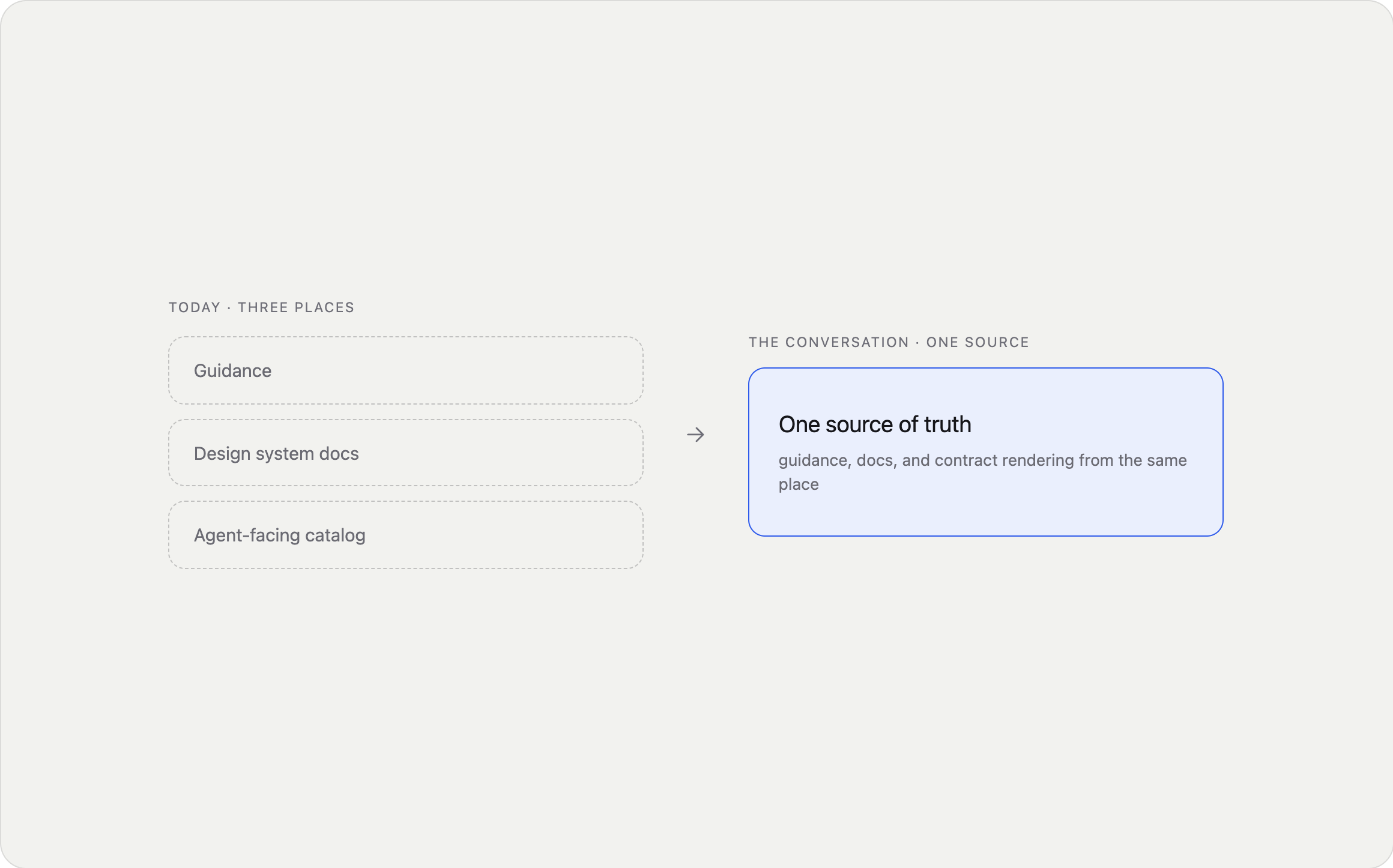
The harder question is where it lives. Right now the guidance, the design system documentation, and the agent-facing catalog are three separate places, which is precisely the fragmentation problem this work exists to solve. Consolidating them is the current conversation.
Workday + Sana taught me that design at enterprise scale is a communication problem. This one taught me it's an encoding problem too. We spent years writing down what our components look like. It turns out we never wrote down what they're for.