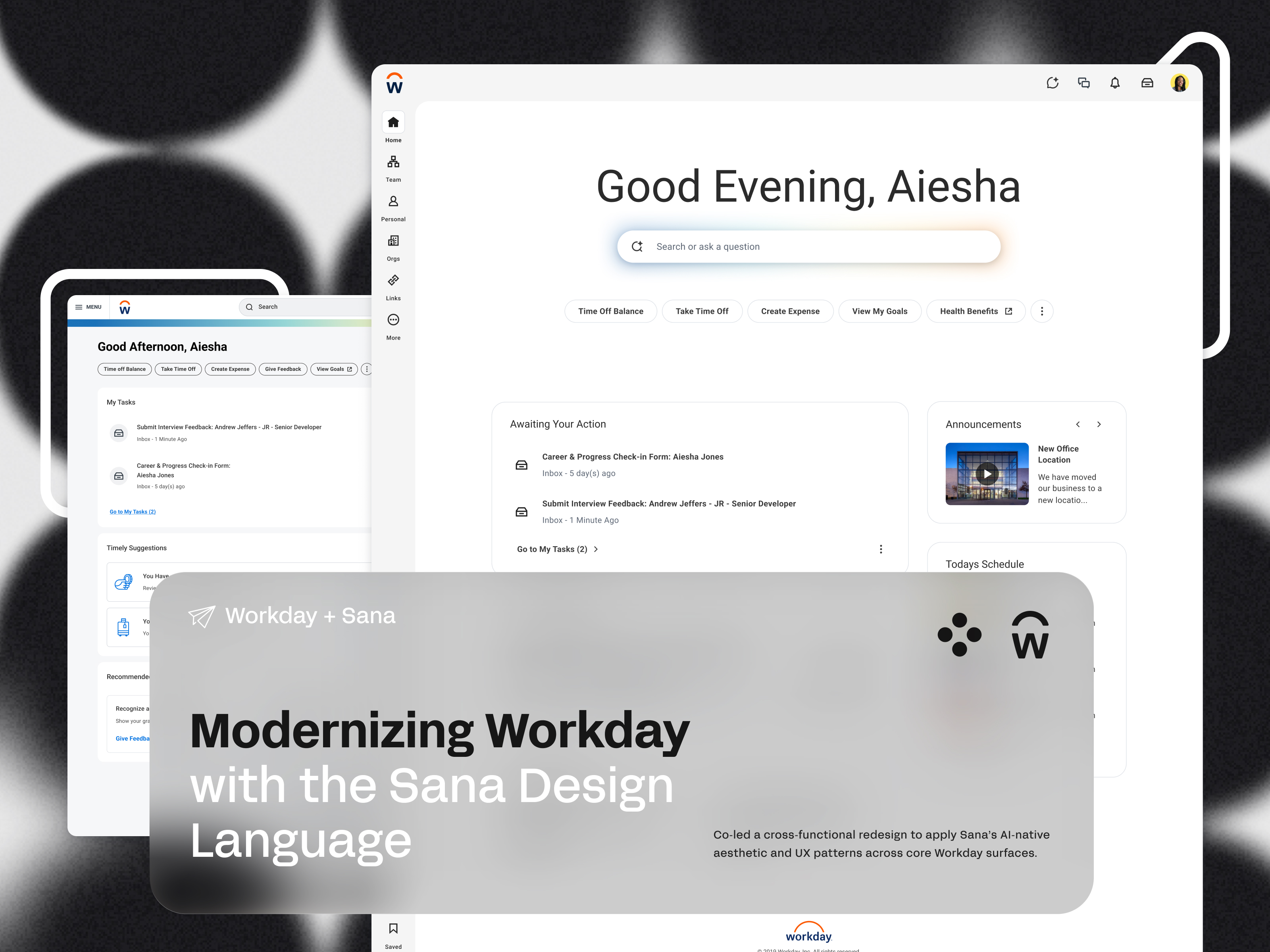

The Context
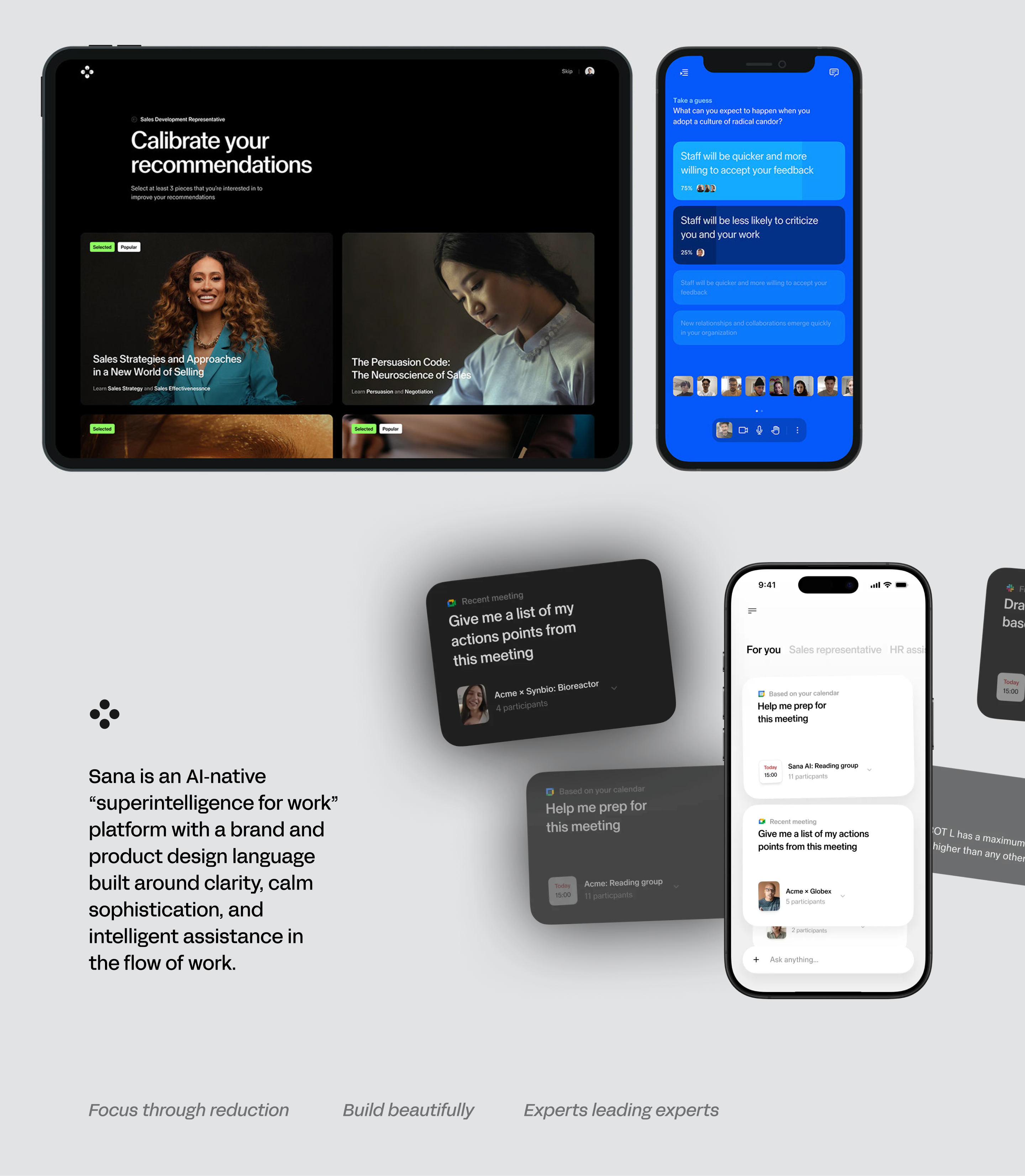
Workday acquired Sana to build a more AI-native front door for work: a unified experience that brought intelligence, clarity, and modern interaction patterns to one of the world's most widely used enterprise platforms.
I co-led the initiative to make that vision real. Our mandate: align Workday's legacy UI with Sana's AI-native aesthetic and interaction principles; across core product surfaces, at enterprise scale, without breaking the workflows of millions of existing users.
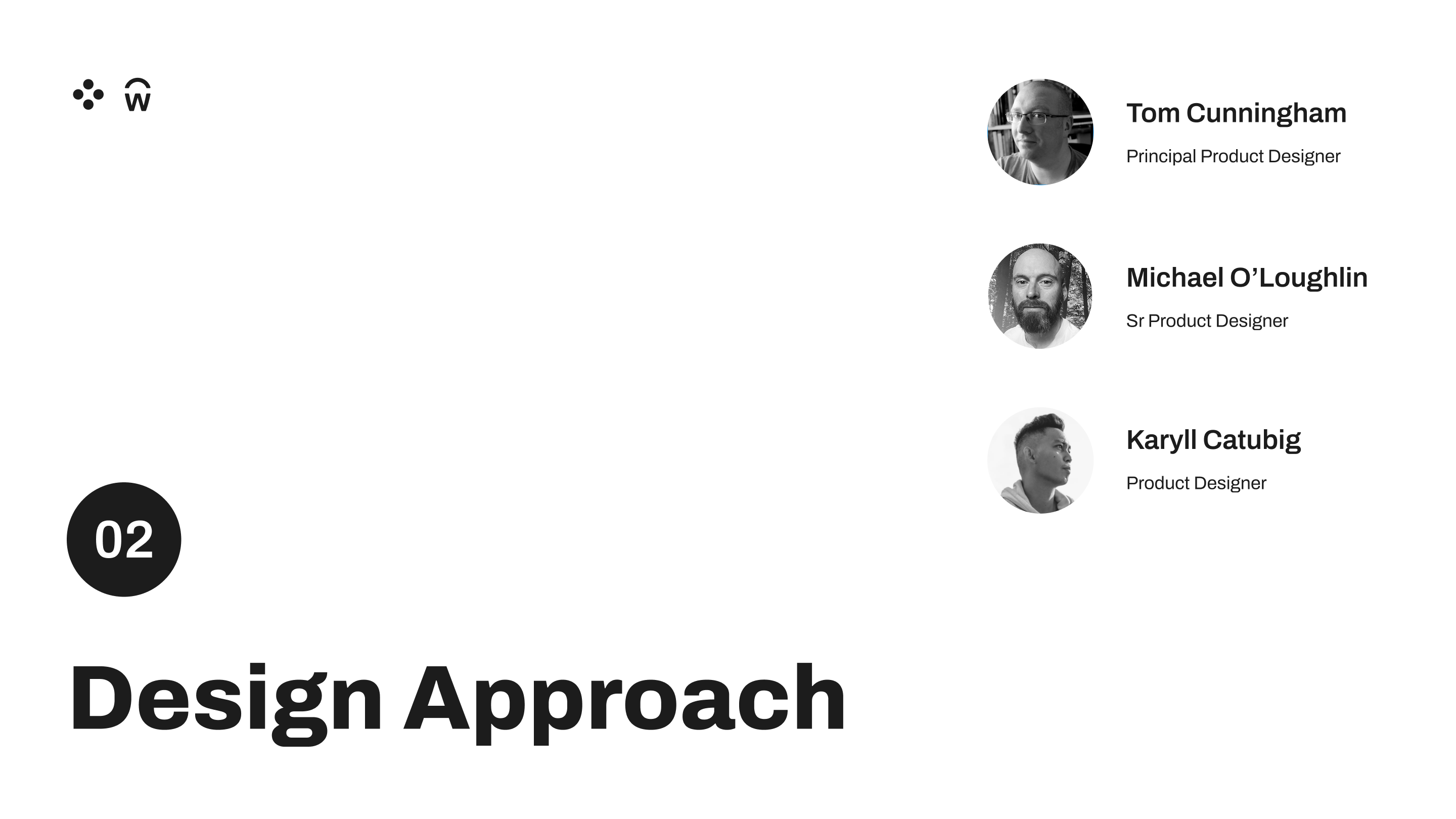
My specific ownership: homepage redesign direction, typography system, component framework, and facilitation of a 20-designer cross-functional surge across product teams.
That last part, the surge, is where things got interesting.
Two Design Languages, One Product
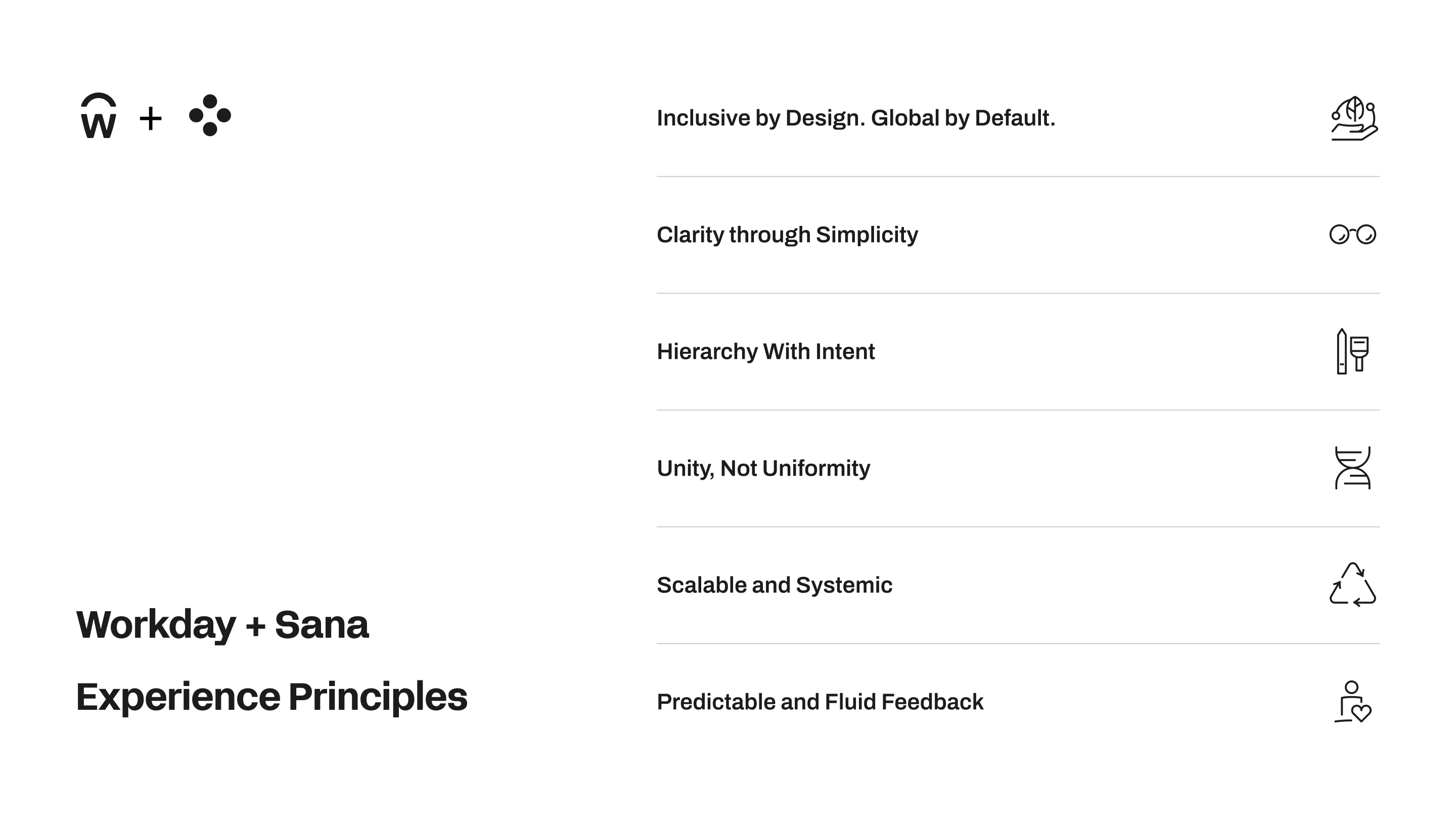
Workday and Sana arrived at the same table with fundamentally different design philosophies.
Sana's principles were built for learning and intelligence:
- Master the fundamentals - trust through well-crafted details
- Don't make me think - make the end goal clear and the path effortless
- Make experiences rewarding - keep users motivated through personal moments
- Make bold bets where it counts - innovation that changes how the world learns
Workday's principles were built for enterprise reliability:
- Empower - humans in control, with flexibility and power
- Trust - always feeling informed, capable, and enthusiastic
- Grow - adaptable systems that support constant change
These weren't in conflict. But they weren't naturally harmonious either. The design challenge wasn't picking one over the other. It was building a grammar that could hold both.
We're building the visual and structural grammar that lets teams innovate without breaking coherence.
What We Heard Before We Started
We ran an internal survey across Workday Slack channels, polling employees as daily users of their own product surfaces, to surface consistent pain points before touching a single frame
Three themes surfaced immediately:
Workday is visually and structurally inconsistent across surfaces. Moving between areas doesn’t feel like moving within one product family.
Page hierarchy is often unclear: everything can feel interchangeable.
Configuration flexibility has unintentionally flattened meaning: What is primary vs secondary content? What should be persistent vs contextual? Where should the user’s attention go?
These weren't aesthetic complaints. They were structural ones. The product had grown faster than its visual language could keep up with. Our job was to rebuild that language from the ground up.
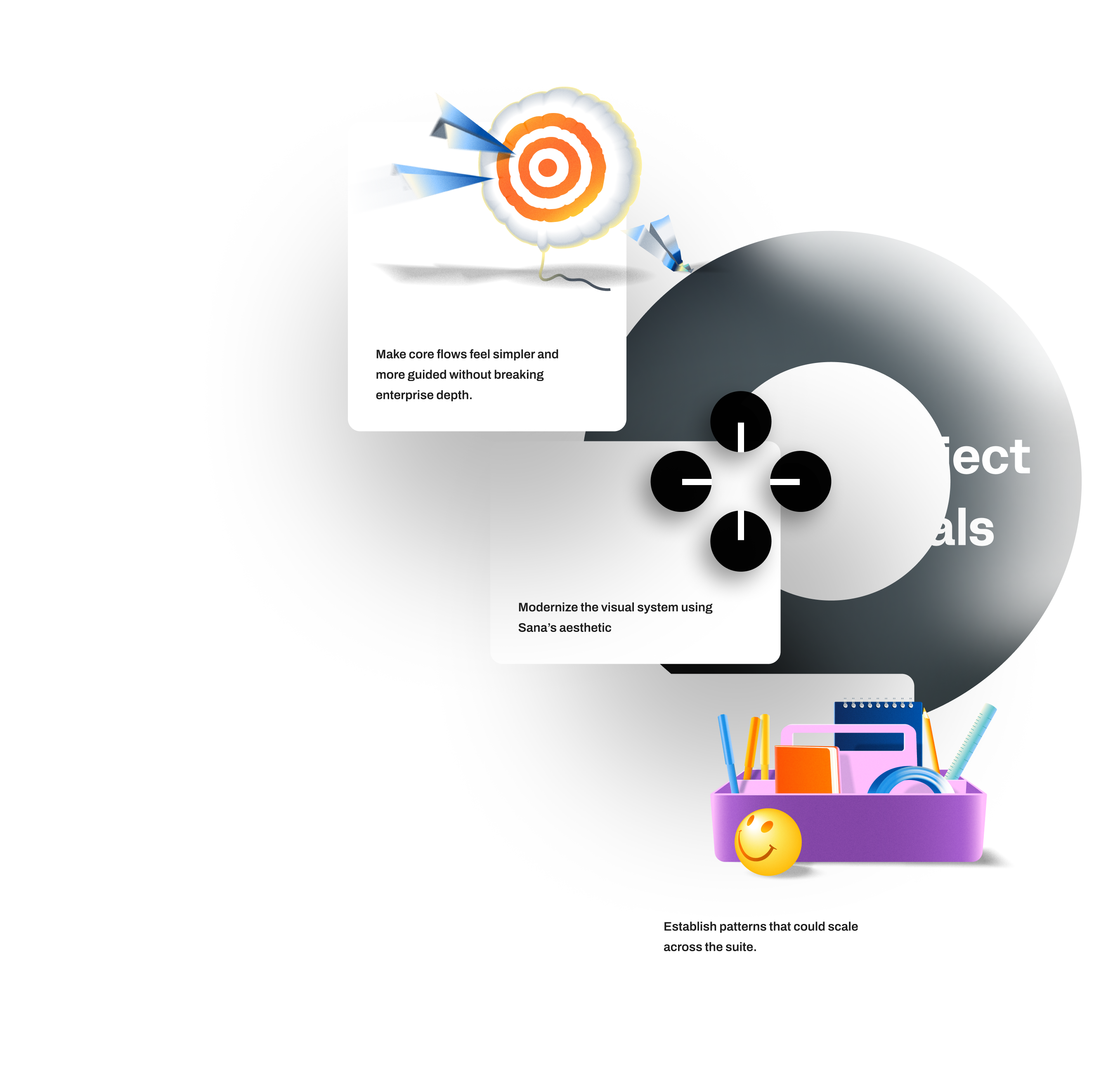
Our Approach - Start With Structure, Not Style
Site Mapping First
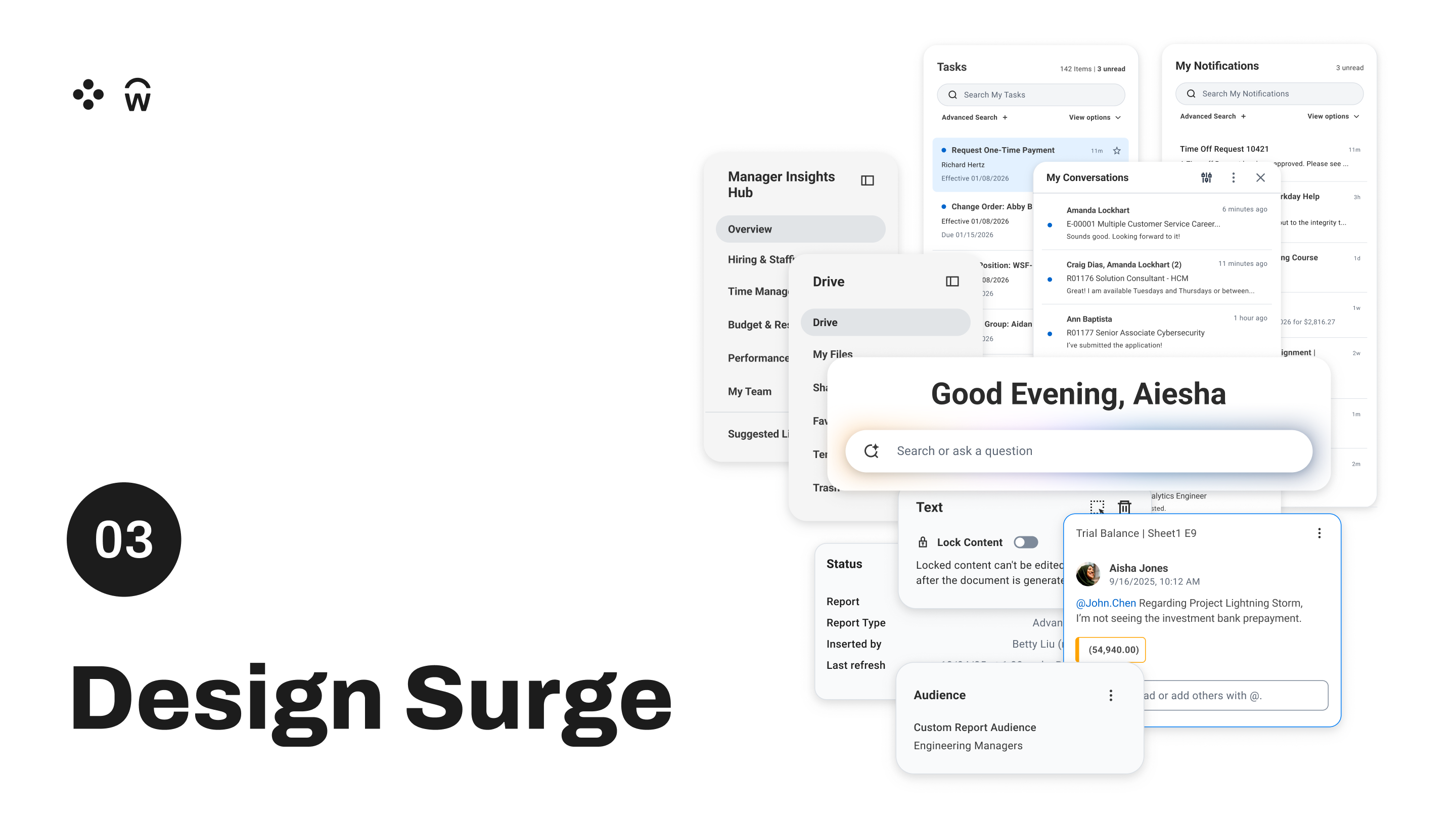
We started by mapping the full scope of Workday's surfaces. Not to redesign everything at once, but to identify the right place to anchor the work. The homepage became our first area of focus. Get the homepage right and everything downstream has a reference point.

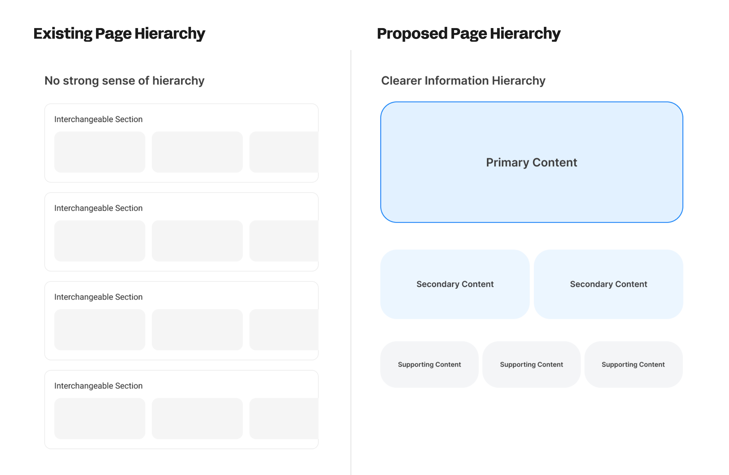
Page Hierarchy
The most urgent structural problem: endless scrolling with no clear hierarchy. Everything competed for attention. Nothing felt primary.
Our approach
Important content at the top, related content in the scroll. Not a visual trick — a structural commitment. The hierarchy needed to be felt before it was seen.
Rethinking Type Hierarchy
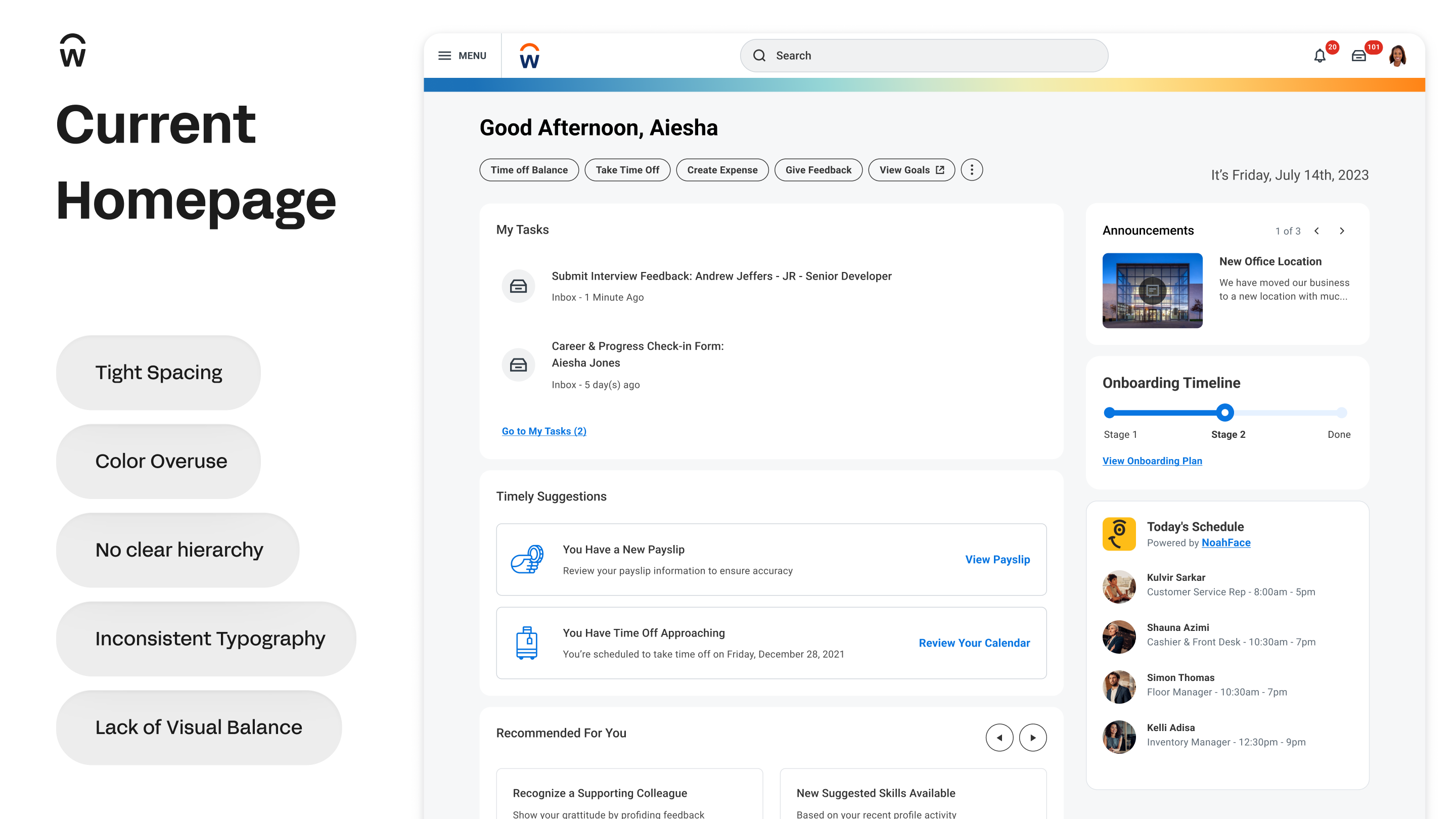
Workday's existing typography had a problem that went beyond aesthetics.
Heavy and bold weights were used as the primary tool for hierarchy, and in several surfaces, colored text was used the same way. The result: users couldn't distinguish hierarchy from affordance. Text that meant "this is important" looked like text that meant "this is clickable." That's not a visual preference problem. That's a broken mental model.
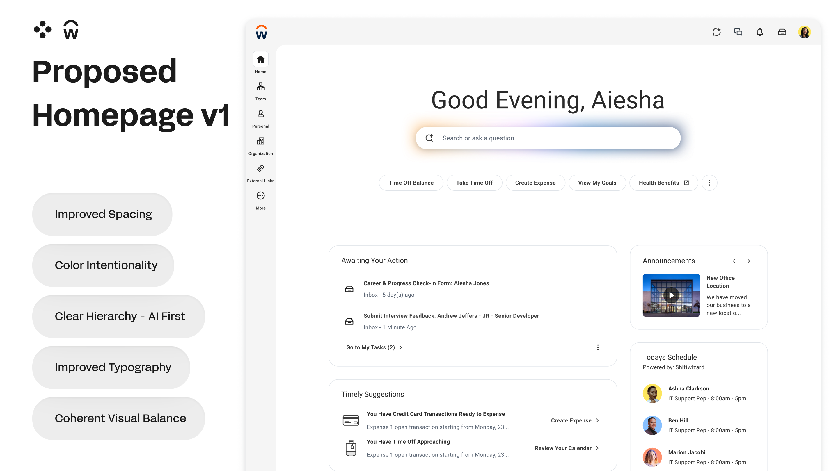
I went back to print. Back into my Graphic Design foundations. Typography in editorial design doesn't rely on weight to create hierarchy; it relies on size, spacing, and restraint. A well-set page doesn't need bold to tell you what to read first. The scale does that. The space does that.
That's exactly why Sana's UI feels different. It's almost editorial - lighter weights, clear size differentiation, intentional spacing, less iconography. Type leads. Everything else follows.
Applying that thinking to Workday meant stripping the false hierarchy - removing the color-as-importance convention, reducing the weight overuse - and letting size and scale do the work they were always meant to do. The Major Second typescale (1.125) wasn't chosen arbitrarily. It was chosen because it creates clear, readable steps without ever needing bold to announce them.
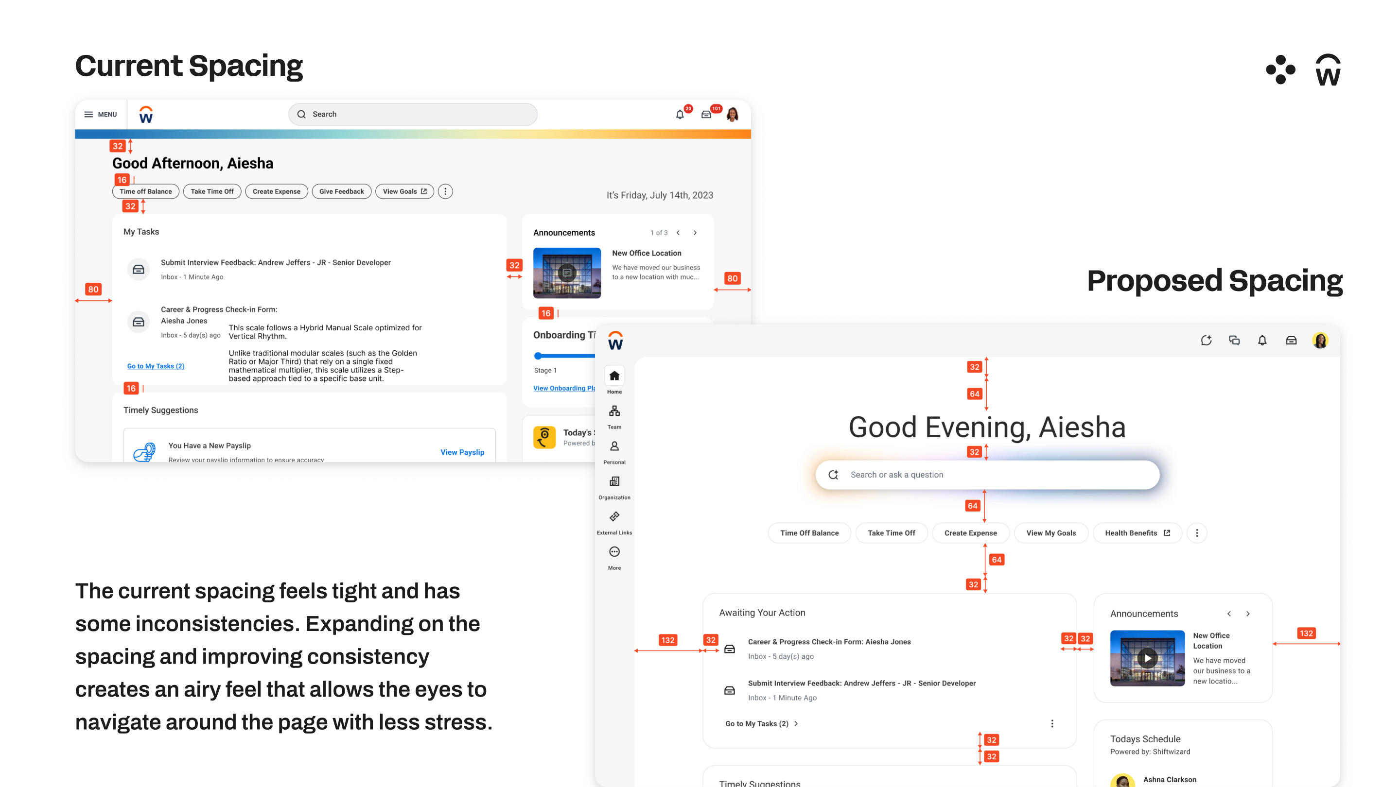
The White Space Thesis
Workday's existing design instinct was to fill the screen. Enterprise software has always equated density with value: more information visible means more power for the user. But density without hierarchy isn't power. It's cognitive overload with nowhere to rest.
My exploration pushed against this directly. Intentional white space isn't decoration, it's a hierarchy decision. It tells the user: this is what matters here, everything else can wait. The result is a reduction in what I'd call visual stress: a fatigue users feel but can't name, because nothing is technically wrong and yet everything competes for attention equally.
The white space changes weren't about making Workday look lighter. They were about making each page feel like it had a purpose; so wherever a user lands in the product, the most important thing is already obvious.
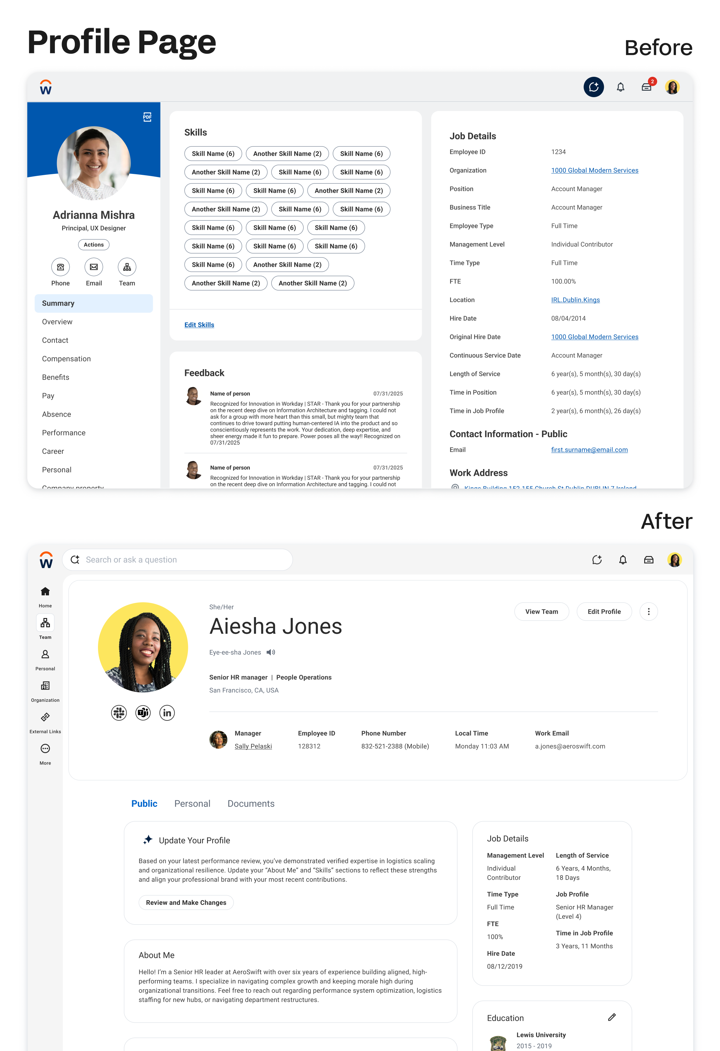
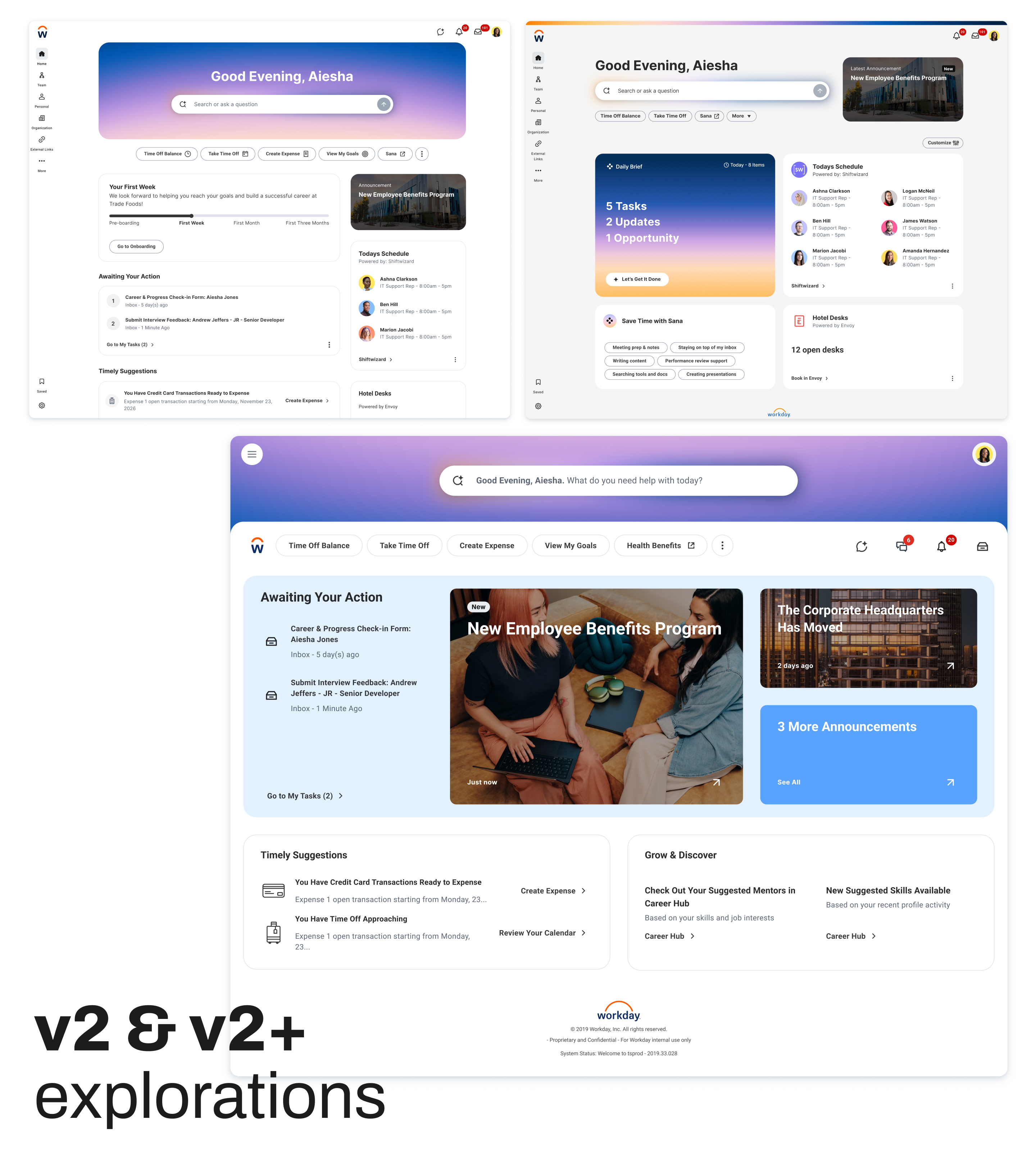
Homepage v1 Direction - Before and After
The v1 concept allowed us to have a concrete design approach establishing a shared direction on components and visual style for other Workday pages.
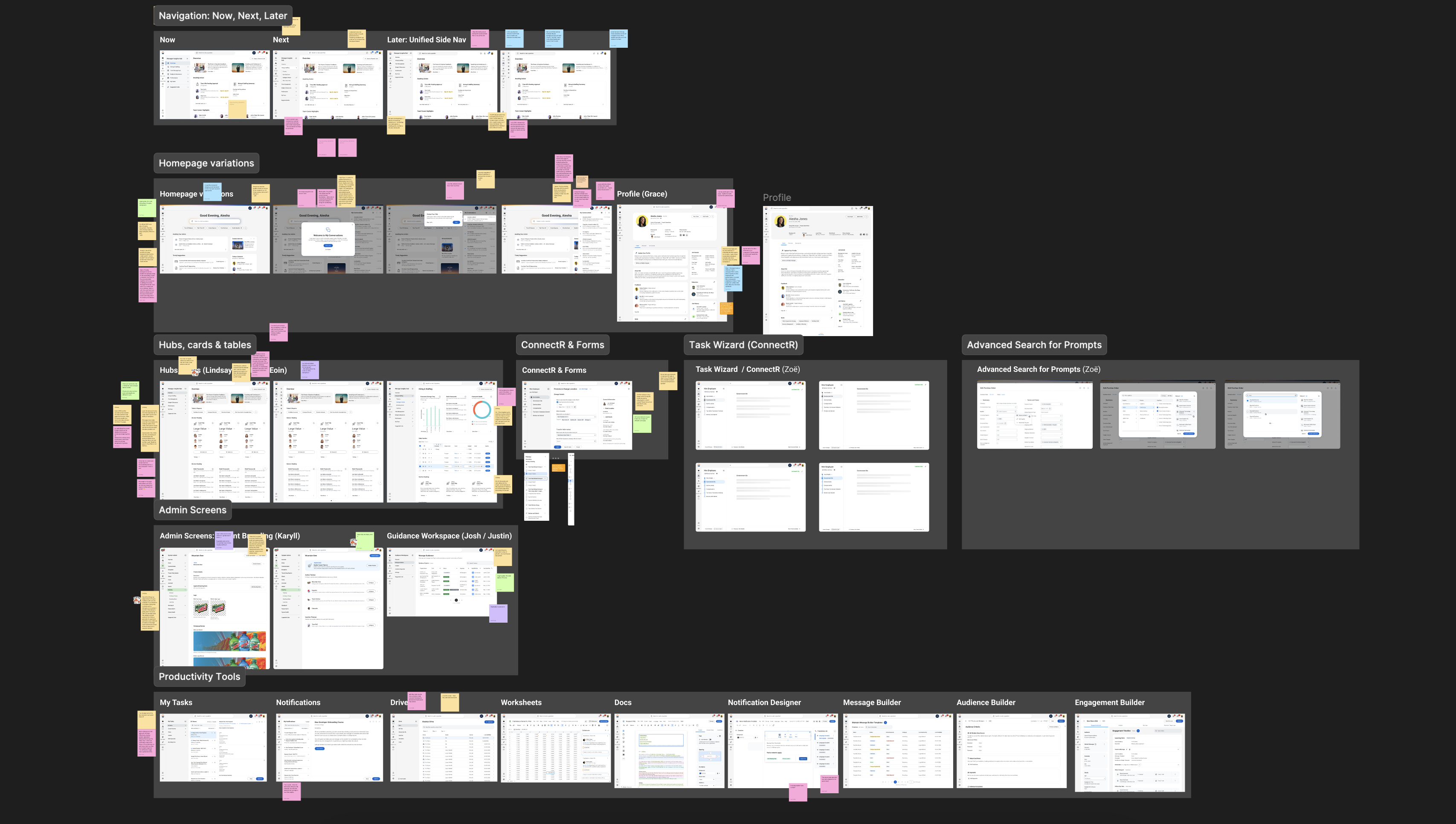
The 20+ Designer Surge
Once the homepage direction was solid, we needed to scale it. We couldn't redesign Workday's entire product surface with two designers. So we brought in 20+ designers from across product teams for a collaborative surge — each working within their own product space, all working within the shared visual grammar we'd established.
This was as much a facilitation challenge as a design challenge. The goal wasn't uniformity, it was coherence. Different product flavors, one family identity.
The surge worked. We shipped a unified component system that product teams could build from.

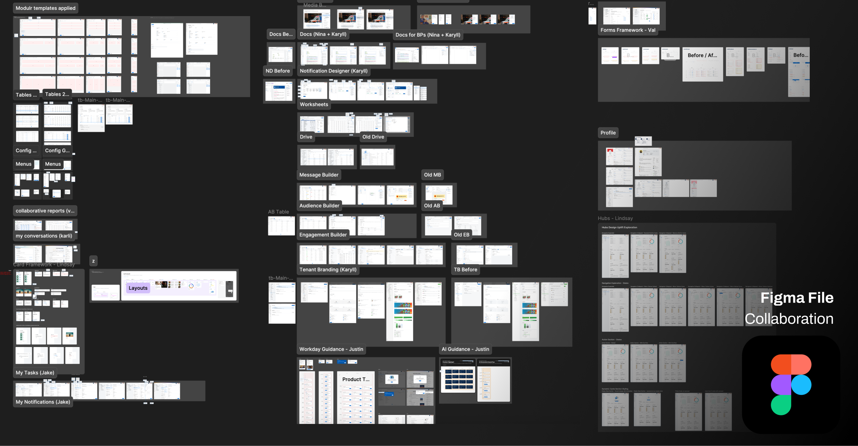
My portion: I owned Notification Designer, Tenant Branding, and Drive end-to-end. Collaborated with Nina on Docs.
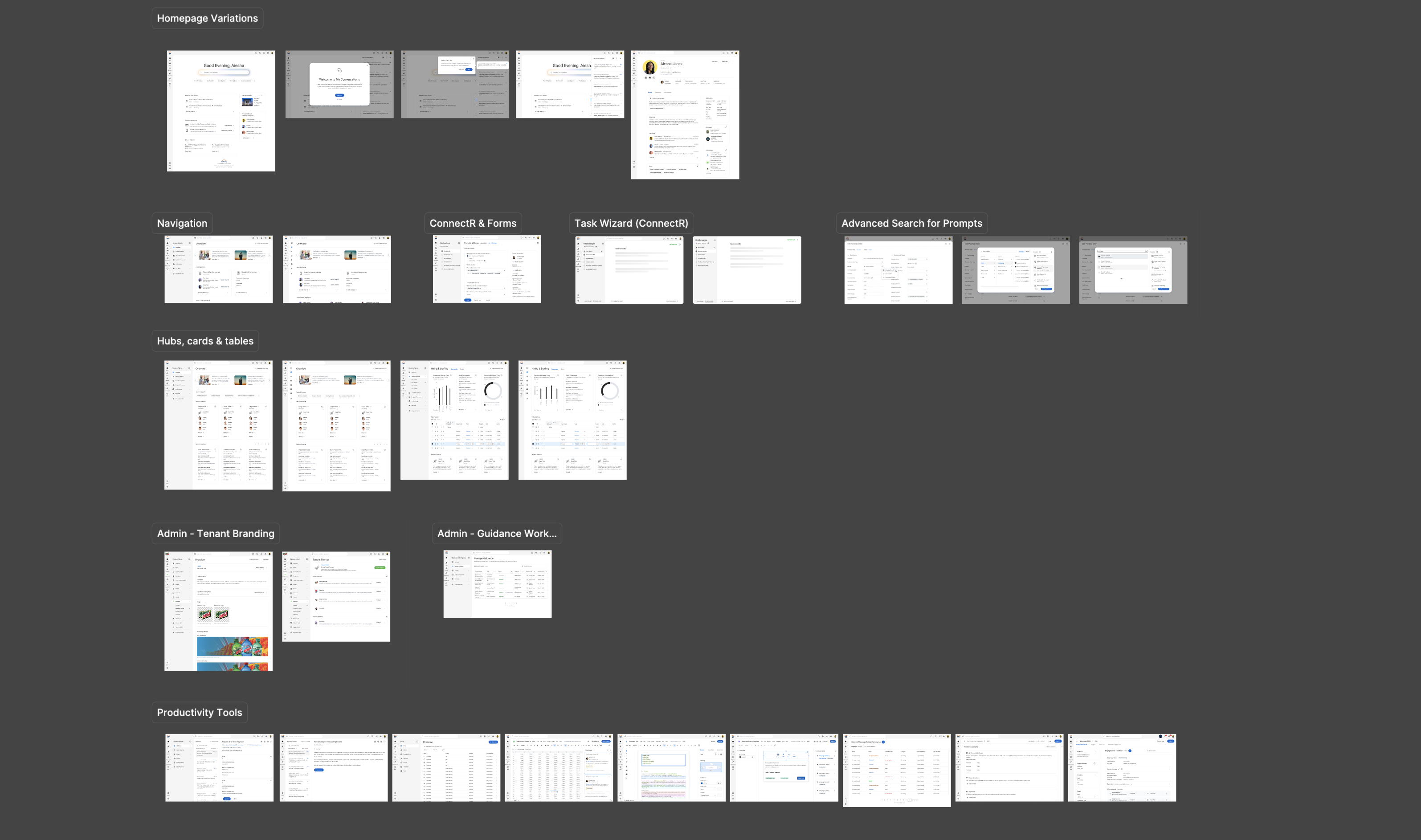
Here are some examples of before and after designs of our vision coming to life.
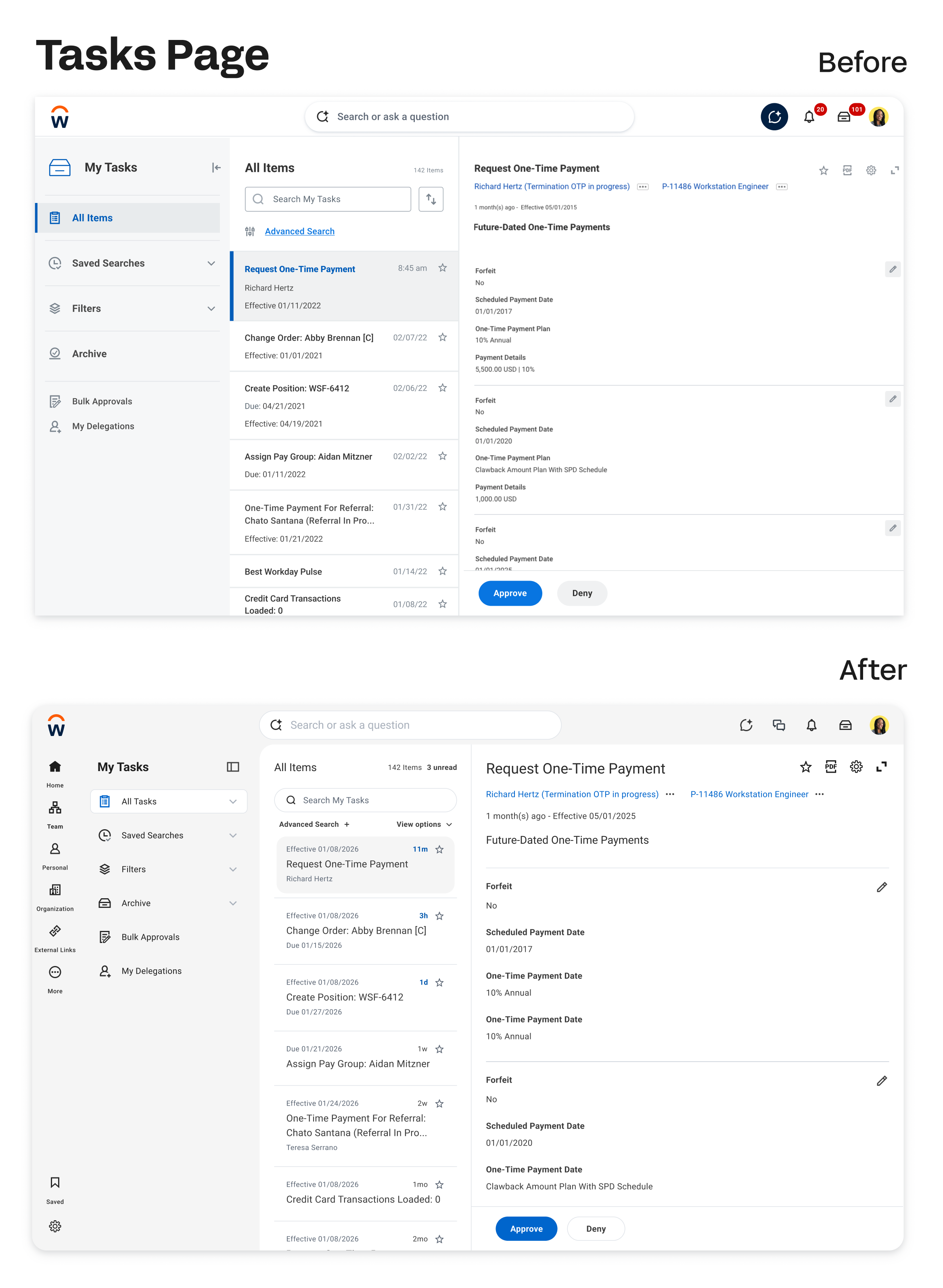
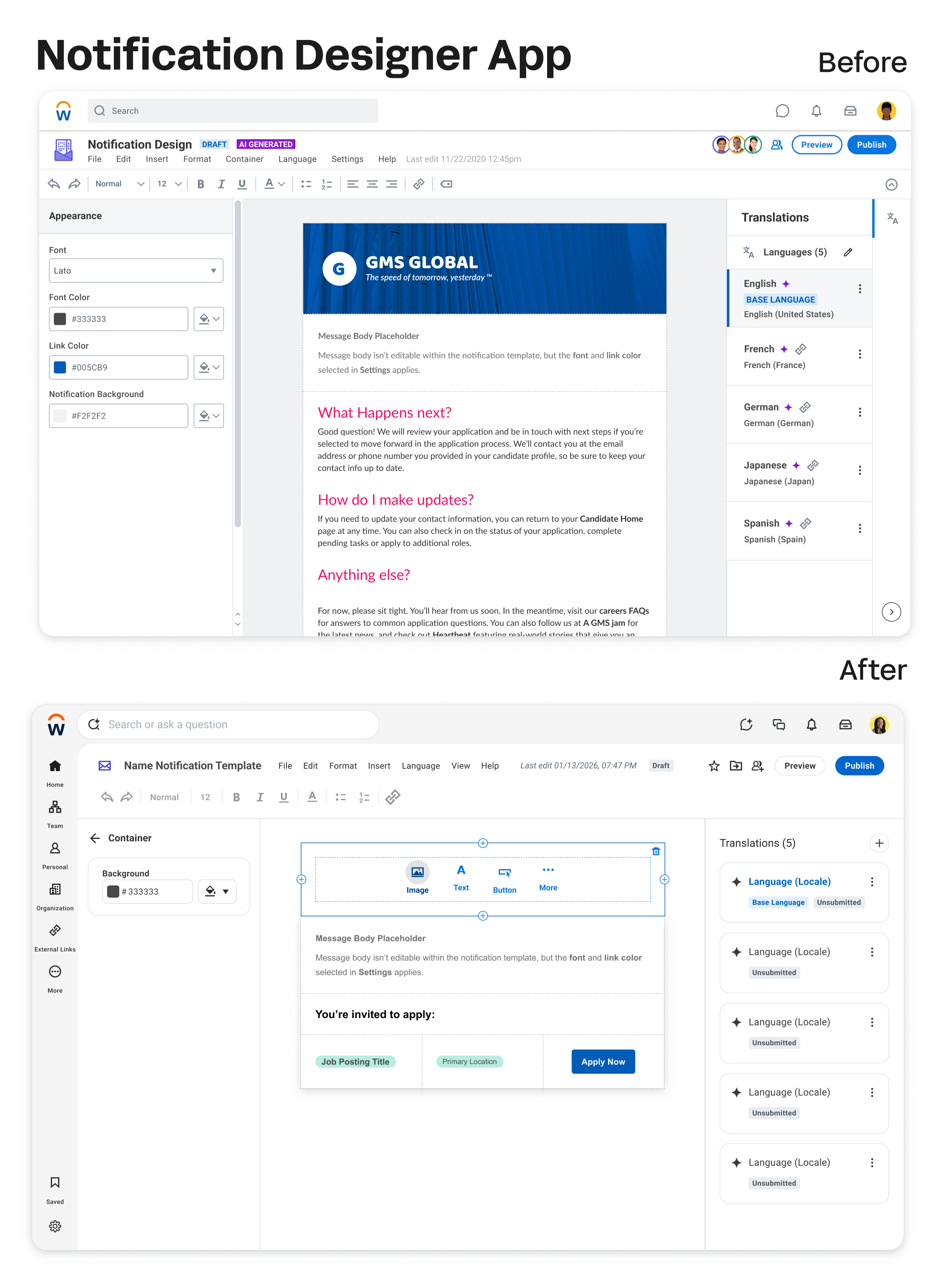
The surge worked. We shipped a unified component system that product teams could build from.
Then the Feedback Came In
We shipped v1. And customers told us exactly what they thought.
These themes came from Workday's customer community forum and internal homepage research sessions conducted after v1 release.
“The new UI feels clunky. I’m curious as to what peer review or testing went into this… The background color changing didn’t add any value, but it does cause more work since now all our existing branding banners and logos have to be updated to match the new color.”
"This is backwards UX experience. Multiple clicks and additional scroll bars – especially in search results. Too much of screen real estate is used by blank spaces!"
"There is no benefit to moving the search bar lower on the home page, only to move it back up to the top on every subsequent page. Consistency in location is better."
“We just enabled this for testing. We can see the search box moved but the search results seem the same as before and there’s no noticeable difference. But in the description it talked about Blending Sana’s AI Capability – could someone give more information on what sort of impact change this is supposed to have?”
The feedback clustered into four themes: deployment and opt-in strategy, UX and navigation regressions, branding and visual issues, and confusion around what Sana AI actually did.
The overall sentiment: the intention was appreciated. The execution felt confusing and risky.
That was hard to hear. And it was exactly right.
The Pivot
When you hear feedback this direct from customers, you have two options: defend the work or learn from it.
We went back to the drawing board.
The v1 problem wasn't purely a design problem. It was a change management problem we hadn't designed for. We'd built a great visual solution and shipped it without adequately preparing customers for what was changing, why it was changing, and how to make sense of the new Sana capabilities they were suddenly seeing in their interface.
This project changed the first question I ask on any new project. It's no longer 'what should this look like?' It's 'what does this person need to understand for this to land?
Three new questions reframed the v2 effort:
How can we improve the visual elements without compromising user experience?
How might we improve the roll-out strategy?
How might we integrate Sana with a clear visual direction that doesn't add confusion?
Three Revised Goals
Improve both visual treatment and user experience where we can.
Be transparent with customers and involve them in the iteration process so that it's not a surprise.
Make sure both Workday's Brand Identity and Sana's Design Principles are displayed cohesively in balance.
The shift in the second goal is the most important one. Involve them in the iteration process so it's not a surprise. We weren't just redesigning the interface — we were redesigning how we introduced change.
The v2 direction is in active iteration.
With customer co-design sessions now incorporated into the process from the start, not bolted on after the fact. The rollout strategy is being redesigned alongside the interface, not after it.
V2+ is the deeper question I'm currently leading.
What does an agentic-first Workday experience actually look like? Not AI as a feature bolted onto existing surfaces - but a conversational front door where Workday's most-used capabilities surface as contextual widgets inside a single intelligent interface. The goal is to make the system feel like it understands you, not just responds to you. This is where my vision work is headed.
This work is in early explorations. I'm not able to share it yet — but I'm happy to talk through the direction in conversation.
Expectation management is a design deliverable.
Design modernization must be paired with an explicit rollout narrative. Even good UI shifts feel risky when users don't understand what changed and why. Communication is part of the design.
Give users control over the pace of change.
Admins need coarse and fine-grained controls to phase in experience changes. Decouple major elements - search, navigation, branding - so adoption can match organizational readiness. One big bang rollout is almost never the right answer at enterprise scale.
Don't trade usability for aesthetics.
Modern layouts should reduce cognitive load, not just visual noise. Every visual change must be checked against navigation effort and learnability for existing heavy users. Beauty that creates friction isn't beauty.
Navigation changes are expensive.
Re-platforming navigation requires role-based IA and global configuration options. Otherwise, everyday workflows become fragile and expensive to retrain. The search bar move was the clearest example: a visually logical choice that created real workflow disruption.
AI UI must be honest.
Signal only what's actually available in a given tenant. Distinguish clearly between semantic search, agents, and summaries. Tie visual cues to real capability, not aspiration. Showing AI features that don't yet function in someone's environment erodes trust faster than not showing them at all.
Design decisions have downstream operational costs.
Documentation churn, training overhead, support load - these are design consequences. A solution that requires rewriting 200 help articles and retraining 500 admins has a real cost that should be factored into the decision. Preserve familiarity where the value of change is low.
What This Project Taught Me About Scale
Building Qento taught me what it means to ship from zero. Workday + Sana taught me something different: how to design when the cost of getting it wrong is measured in millions of disrupted workflows.
At that scale, design is never just about the interface. It's about the rollout. The communication. The opt-in controls. The downstream training costs. The trust you're either building or eroding with every change.
The v1 feedback was uncomfortable. It was also the most valuable design education I've had, because it came from real customers experiencing real disruption, not from a usability test or a stakeholder review.
V2 is built on everything they told us.
What's Next
The v2 direction is in active iteration
With customer co-design sessions now incorporated into the process from the start, not bolted on after the fact. The rollout strategy is being redesigned alongside the interface, not after it.
That sequencing change
Designing the communication strategy in parallel with the product, is the most important thing that came out of v1.